Showing posts with label Cuttlebug. Show all posts

Sunday, July 4, 2010

God Bless America!


Happy Fourth of July bloggers!  This is a very quick post of a card I  whipped up for the holiday using Stampin' Up's "July Fourth" stamp set and the coordinating "stamping around" wheel.  I usually remove the rubber stamp from the wheel (a trick my friend Emma taught me) because its so much easier to use as a regular stamp (I just never can get the right ink coverage or details where I want them otherwise).

On this card I also used the Cuttlebug stars embossing folder. 

Here's hoping that everyone has a safe and relaxing holiday with friends and family.  Enjoy your day and thanks for taking time to peek in at my blog!

Happy stamping!
 

Thursday, June 24, 2010

Gordon - High Hopes Challenge #81

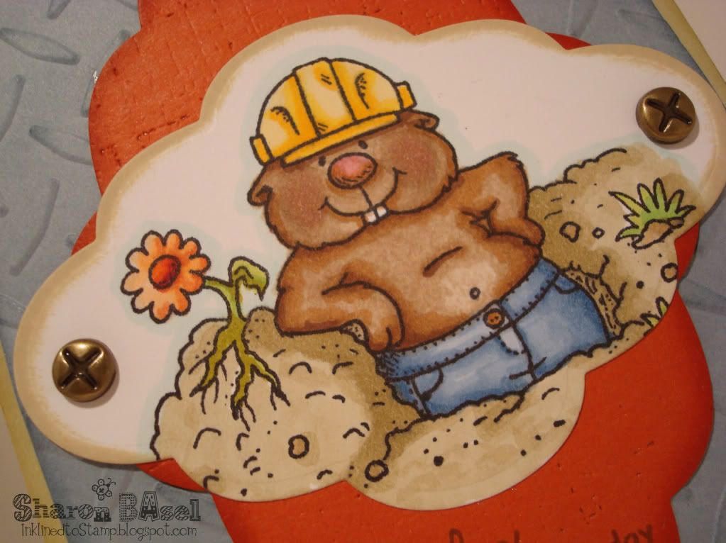
This is one of my favorite High Hopes stamps. The little critter's name is Gordon.  Doesn't he just crack you up?!  I had decided to use Gordon on the Dad's Day card I made for my son to give to my hubby since their bellies look about the same!!!!  This also meets the High Hopes Challenge #81 which is "anything goes". 


I started by coloring my friend Gordon with my Copic markers and he is a fun one to color (most of the High Hopes stamps are).  I used my Spellbinders Nestabilities Labels 6 dies to cut out the image and sponged the edges with Tim Holtz' "Old Paper" distress ink. 

The Terracotta layer (Papertrey Ink cardstock) was also created using the Nesties Label 6 dies and then distressed using Papertrey Ink's impression plate "linen and canvas".  The sentiments are from Amuse stamps.  I used Stamping Up's Bordering Blue paper for the back panel, embossed the texture from a Cuttlebug "diamond plate" embossing folder and sponged the edges with the same color ink. The card base is SU River Rock cardstock.

You just can't help but smile at Gordon and his teeth and belly.  Hope you like this stamp and card as much as I do.  Thanks for stopping by my blog!

Monday, April 5, 2010

Easter Blessings

Just a quick post today with two of my favorite Easter cards that I made for my family.  The first one uses this wonderful rabbit image that I got nearly a year ago from a stamp show.  It's from Stacy Stamps and was new to their line last summer.  I colored the image using my Prismacolor pencils and gamsol to blend them.  I paired this with the beautiful DP called Old Fashioned Eggs from Karen Foster papers. 

The rabbit image was mounted on the vanilla cardstock that was cut out using the Top Note die from Stampin' Up that I first stamped with a script stamp and then distressed using Tim Holtz Distress Inks in Tea Dye and Antique Linen.  I also used a bit of Regal Rose in the distressing to pick up the subtle pink tones in the DP.  The background and accent cardstock is SU True Thyme.  SU and EK Success punches were used on the Thyme bands that run across the card and the greeting panel.  Papertrey Ink Melon Berry ribbon and buttons were also used.


The second Easter card uses the adorable "Chocolate Bunny" stamp from Stampin' Up.  I made this card for my niece Olivia who is a choco-holic to the max.  I knew she'd get a kick out of the stamp - she's a little stamper herself and of course I endorse and promote that with stamps, inkpads and cardstock as gifts to her.

The chocolate bunny was stamped in Chocolate on Close to Cocoa cardstock and distressed a little with Caramel and Cocoa ink (which is hard to see in this photo).  It was mounted onto paper where I had stamped the grass from SU "Inspired by Nature" in Celery and Mellow Moss.  The rest of the background was lightly sponged with Bashful Blue.  The eggs were cut from an older DP from It Takes Two.  I framed the image using Spellbinders Classic Frame die cut from Basic Grey's Green at Heart paper.  The other cardstock used is Celery, embossed with Cuttlebug Swiss Dot embossing folder and PTI's Plum Pudding cardstock.

Hope you all had a wonderful Easter and I thank you for stopping by my blog.

Thursday, March 25, 2010

Good Grief Charlie Brown

My brother loves all things Charlie Brown and Snoopy so I grabbed this stamp knowing I'd use it in a card for him.  I colored the image using my Copic markers and cut it out using my Nestibilities Labels 2 dies.  For the background polka-dot panels, I stamped them using a background stamp from a My Favorite Things stamp set and also randomly colored in the dots with the same copic markers as the main image panel.  The color background panel was embossed with a Cuttlebug folder.  The cardstock is all Papertrey Ink.

Thanks for looking!

Sunday, January 3, 2010

Happy Birthday Mom

Today is my Mom's birthday and I made this card for her. Lots of detail and layers on this one.

I first saw this technique on the Flourishes blog from the Limelight Designer for December, Yvonne. She is one talented stamper - I've been following her blog (Yvonne's Stamp, Paper and Ink) for a while. The most beautifully creative cards I've ever seen. Yvonne is an expert in creating with Spellbinders dies and when I saw what she did with the Spellbinders Classic Frame I put them on the top of my Christmas list because I knew I wanted to create that design for my Mom's birthday card.

The link to Yvonne's tutorial for this design is here.


For the image I used Papertrey Ink's "In Bloom" stamp set, stamped in PTI Smokey Shadow ink and colored using my Copic Markers.

Thanks so much for looking!

Happy Birthday Mom!!!

Recipe:
Stamps - Papertrey Ink "In Bloom", Sweet Impressions Stamps for the sentiment; Stampin Up "En Francais" background stamp
Cardstock - Stampin Up Saffron, Mellow Moss, Vanilla, Really Rust
Ink - Stampin Up Really Rust, Copic Markers for the image, PTI Smokey Shadow ink
Accessories - Spellbinders Classic Frame, Labels 1 dies; Fiskars Heritage corner punch; pearls and Stickles glitter; Martha Stewart butterfly punch; Cuttlebug embossing folder

Monday, August 31, 2009

Sweet Violets


Sometimes you just make a card that is one of your favorites of all time! Maybe it's the image and how you colored it, the layout you used, the colors or the technique. Well this is one of those cards for me.

I had been admiring the Sweet Violets set from Flourishes for some time now but hadn't ordered it - don't know why? Because I was to get it as a wonderful birthday gift from my dear friend and fellow stampaholic Heide! The best birthday present ever! Now every time I use this set I will think of her which makes it pretty special! Thanks Heide!

I made this card for an incredible woman at work that is retiring at the end of September. And with the pearls I used as embellishment, it qualifies for this week's Flourishes Timeless Tuesday Challenge-FTTC30! Each Tuesday a new challenge goes up on the Flourishes Newsletter Blog.

For the card, I stamped the image and colored it with my Copic markers (Flourishes stamps are perfect for the Copics). Instead of just cutting out the whole image with one of my Nestabilities dies, I thought it would be more interesting, and make the beautiful image stand out more, if some of the image was outside the die cut. So I traced from the Labels 1 die, keeping the leaves hanging over and cut it out by hand. I love how that looks! I then multi-layered the image using Spellbinders Shapeabilities Fleur de Lis with Sage Shadow cardstock and Nesties Label 1 for the Almost Amethyst and Banana cardstock layers. I like the look of the Banana layer which seems to bring focus to the image.

For the background, I used my Cuttlebug Swiss Dot embossing folder on VELLUM! With this being a 5 1/2" square card, the embossing folder didn't fit the whole piece. So I carefully repositioned the vellum in the folder for a second time through the Cuttlebug. Even then, there was a small patch that wasn't embossed, so I lined that area up in the folder and with a little hand pressure, made the final embossing on the vellum. It doesn't really take much pressure to emboss on vellum - give it a try! I just used regular adhesive to attach the vellum but did so behind the multi-layered focal image so it wouldn't be seen and the ribbon I used also keeps it in place.

So that's the story of my new favorite card. Hope you like it!

Thanks for visiting my blog today!

Recipe:
Stamps - Flourishes "Sweet Violets", SU Oval All
Cardstock - Almost Amethyst, Sage Shadow, Barely Banana, Vellum
Ink - Palette Noir Black
Accessories - SU organdy ribbon, adhesive half pearls, Nestabilities Labels 1 dies, Shapeabilities Fleur de Lis die, Cuttlebug Swiss Dot embossing folder, oval punch

Thursday, August 27, 2009

Blooming With Buttons

This card uses the layout from the Splitcoast sketch challenge 243 this week. I really had fun with this sketch and with using this darling Cosmo Cricket paper.

I also adore this stamp set "Button Bits" from Papertrey Ink. Buttons on cards are so perky and this particular stamp using the buttons as flowers is divine. I mean who doesn't love flowers - especially flowers made of buttons!

Papertrey offers so many different colors of their vintage buttons and they're such a good value. And they're so pretty in my craft room in the glass jars I store them in! It's eye candy in my room!

Pretty simple card really. Thanks for visiting my blog!

Recipe:
Stamps - Papertrey Ink "Button Bits"
Paper - Papertrey Ink Berry Sorbet and Vintage Cream, Stampin' Up Blue Bayou, Cosmo Cricket Girl Friday DP
Ink - SU Kiwi, PTI Vintage Cream
Accessories - PTI vintage Buttons, Ribbon, Nestabilities Labels 1 dies, Martha Stewart scallop edge punch, Cuttlebug Swiss Dots embossing folder

Saturday, August 22, 2009

Summer Sunflowers

I made this card using the layout from Splitcoast sketch challenge 242. It didn't take me but a second to determine what image I'd use - I'd just received my new Papertrey Ink order in the mail and couldn't wait to get ink on this sunflower stamp!

I stamped in Palette Noir Black and colored the image with my Copic markers. A little sponging to try to anchor the image and then I mounted it on a scalloped rectangle I cut with my Nesties dies from Papertrey's Enchanted Evening blue cardstock.

The background panel is Bordering Blue and stamped with the Aida Cloth background stamp from SU using Enchanted Evening ink (from Papertrey). Other cardstock used is Caramel and Buckaroo Blue - both SU.

I couldn't resist using buttons on this one - I love how buttons are back in style as a design element now. These buttons are from Papertrey - Enchanted Evening Vintage buttons.

Thanks so much for visiting my blog!

Recipe:
Stamps - Autumn Abundance from Papertrey Ink; Aida Cloth background from Stampin' Up!
Paper - Stampin' Up Bordering Blue, Buckaroo Blue, Carmel; Papertrey Ink Enchanted Evening
Ink - PTI Enchanted Evening; Palette Noir Black; SU Caramel
Accessories - PTI ribbon, buttons; hemp cord; Nestabilities scallop rectangle dies; SU scallop edge punch; Cuttlebug embossing folder

Wednesday, July 15, 2009

SCS Color Challenge

Here's my card for the SCS color challenge - use Barely Banana, Lavender Lace, Going Gray or black, and white. I chose to go with the Gray as it's a softer color that I thought worked better for this image and the layout I created.

I started with Banana for the base card and layered an embossed piece of banana cardstock mounted on the gray. The bottom layer was embossed with the Cuttlebug script folder. On top of that and vertically oriented, I stamped Papertrey's Polka Dot Basics on banana with gray ink and also mounted that on the gray cardstock.

The main image is one of the great stamps from Stacy Stamps. I stamped the image on to watercolor paper with black Stazon ink and watercolored the image with Lavender Lace ink using my aqua painter. For some of the darker shadowy areas of the image, I used my Lavender Lace marker for deeper color. The flower center is watercolored in banana and I added some banana glitter from Stamp LaJolla. I sponged banana ink all around the image for greater depth.

This is such a great stamp for watercoloring. And, the image always looks nearly 3D or multi-layered when you watercolor it.

For a more distressed look and to break up all the straight lines of the card, I tore the edge of the watercolor paper and the gray cardstock it is mounted to. I also sponged the edges with gray ink to slightly distress and soften the look. The Lavender cardstock the image is adhered to was embossed with the rugged lines embossing folder by Cuttlebug. The main image was popped up using foam tape.

At first I wasn't sure about the color combination but I really like it with this card and image. I would definitely choose this combo again. What do you think?

As always, thanks for visiting my blog!

Recipe:
Stamps - Stacy Stamps 1071C Zinnia, Papertrey Ink Polka Dot Basics
Cardstock - SU Barely Banana, Lavender Lace, Going Gray, Watercolor paper
Ink - Barely Banana, Lavender Lace, Going Gray
Accessories - Ribbon (unknown), Cuttlebug embossing folders (script & ragged lines)