Showing posts with label Buttons. Show all posts

Saturday, July 31, 2010

Gone Fishing - SC291

Just a quick post with a card I made for the Splitcoast sketch challenge SC291.  This is a card for a friend of my son.  I decided to use a stamp set I've had but haven't used much.  The set is from Darcie's Stamps (Fishing Fun) and it's a really great set for guy cards.  And believe it or not, the stamping, coloring and cutting out of the images went really, really fast. 

I thought it would be cute to try to make it look like a fish was caught in a net.  So I used drywall tape right off the roll and scrunched it up a bit as I placed it on the panel.  I placed a fish and a lure in the "net".  And that's all it took for this catch of the day!

Thanks for stopping by today.

Recipe:
Stamps - Darcie's Stamps "Fishing Fun"
Paper - DP unknown (from my stash), Stampin Up Pear Pizazz
Ink - Palette Noir Black, Copic Markers
Accessories - Drywall Tape, Button - PTI vintage buttons

Thursday, July 15, 2010

Make Your Own - MMSC62

Hello wonderful followers of my blog!  Today's card is for this week's Midnight Madness sketch challenge MMSC62 pictured below.  I had a lot of fun with this sketch.  And I love the Midnight Madness ladies  - they are lavish with their comments on the creations you enter in their weekly challenge - makes you feel so good! 

When I first saw this sketch a whole other idea came to mind. Until this morning when this card popped into my head and I rushed right off to bring the idea to life.

I grew up sewing as a kid - made doll clothes and by middle school was making my own clothes. I still sew but not as much as I would like - rubber stamping sort of steals all my time.  So I fell in love with this Hero Arts image called "Make Your Own" and fashioned after an old sewing pattern. Brought back lots of memories!  The other stamped image of a dress form is from Darcie's Stamps.

For the card I used, of course, Cosmo Cricket's "Material Girl" papers.  The background paper is also CC from "Garden Variety".  Both lines of paper coordinate together beautifully and I've been using them a lot lately.  Such nice warm colors. Plus a little bit of Antique Linen distress ink on everything helps add to the vintage feel of the card.

Instead of pure rectangles, I used an EK Success label punch for the curvy shapes.  For the main image panel background in Wild Wasabi I used my Nesties Label 8 die and sewed around the edge.  After all, a sewing-focused card has to have some sewing on it - right?!!  Oh ... and buttons (lots of  them) too!

Thanks for stopping by!


Recipe:
Stamps - Hero Arts "Make Your Own", Darcie's Stamps JCS112
Paper - Cosmo Cricket "Material Girl" and Garden Variety, PTI Vintage Cream, SU Wild Wasabi, Dusty Durango, Baja Breeze
Ink - Palette Noir Black, Tim Holtz Distress Ink "Antique Linen"
Accessories - EK Success Label punch, Fiskars "Heritage" corner punch, Spellbinders Nestabilities Label 8 Dies, PTI Vintage buttons, Lace

Tuesday, July 13, 2010

I'm Flying High Today....!

Well I'm flying high today...  I just found out my card "Tea Time" received recognition as one of the Midnight Madness Remarkables!  Holy moly what an honor - you've just got to see the "remarkable" talent and creativity of the crafters that participate in the Midnight Madness challenges and the works of art that come from the design team there - quite humbling I would say!  My feet are doing a little happy dance right now!  Thanks to everyone on the Midnight Madness design team - Brenda, Carol, Charlotte, Darsie, Denise, Gunn, Holly, Linda, Pam, Phyllis, Priscilla and Tracy!

And now on to my card for today....pretty fitting for the occasion since I'm flying high, right?!!

I made this card for a friend of my son's who loves my handmade cards and keeps them all year long on display in his room - like they are heirlooms or something!  He's such a cutey about that.  And his fondness for my creations prompts me to put just a little more effort in each time to make the next card the best.


For Michael's birthday card this year I used Papertrey's Up Up and Away stamp set.  I think this is a great stamp set for making guy cards.  I colored the balloons with my Copic markers after deciding on the cardstock and designer papers that I would use.  I liked the richness of these colors together - Riding Hood Red, So Saffron, Olive and Brocade Blue (all Stampin Up).  And conceptually I had this layout in my head so the card went together pretty quickly. 

For the clouds, I used the Papertrey cloud dies and their stampers select white cardstock. The large ones I popped up using dimensionals and then also used dimensionals to pop up the balloons on them.  And while Papertrey also makes dies for the balloon shapes, I cut these by hand.

I was pleased with how this turned out but Michael was ecstatic and told me I make the best cards.  I just love that kid!

Thanks for flying along with me today!


Recipe:
Paper - Stampin Up Riding Hood Red, So Saffron, Olive, Brocade Blue; SU designer papers all retired now
Ink - Palette Noir Black, Copic Markers E33,YR23,YR31,R27,R29,R59,B45,B97,G94,G99
Stamps - Papertrey Ink "Up, Up and Away"
Accessories - Papertrey Cloud Dies, Nesties Scallop Circle Dies, SU Scallop edge punch, Papertrey vintage buttons

Saturday, June 26, 2010

Friendship in a Jar


The last stamp release at Papertrey Ink was fabulous.  When I saw this set revealed during the countdown my heart jumped a beat.  From there the release date couldn't come fast enough and then the snail mail couldn't be slower it seemed.  Well I got the "Friendship Jar" set this week and I've been itching to get going with it.  This is my first project using this wonderful set.

My vision from the moment it was revealed was to use real fabric for the jar lid - so that's what I did here.  I pulled this blue and turqoise fabric from my fat quarters stash because I thought it would coordinate so well with the coloring I did on the jar.  My vision for that was the old aqua glass canning jars of yesteryear.

I started by using the coordinating jar and lid die from Papertrey to cut out the images - one die cuts the jar and the lid.  The image was then stamped with Pallette Noir Black and colored with my Copic markers, using BG10 for the glass.  Colors C1, C3, C5 were used for he lid.  I also used the coordinating dies to cut out the fabric.  I did it in the same manner as you would for cardstock.  The dies cut well through just about anything.  I adherred the fabric to the jar with Scor-Tape and did the same with lid on top of the fabric.  The jar label was done in a similar manner, again using the coordinating label die for this set.  I stamped the outline in PTI Smokey Shadow and then the "my friend" image in SU Brilliant Blue - this color worked best with the fabric.

For the background panels I used my Nesties Label 1 dies.  I left the die attached with the white cardstock and then stamped the polka-dots, also in Brilliant Blue, with it still in the die.  The result is the white border edge on that panel.  And then the best of all, I used the same Nesties to die cut my fabric for the other layer and it worked great!  Yes that is fabric, not designer paper!

The base panel is SU Cool Carribean cardstock that I sponged the edges with Night of Navy ink and stamped with Cool Carribean the floral image from Stampin Up's "Charming" stamp set.  Night of Navy is the base card color.  I embellished with a few PTI vintage buttons (Hawaiian Shores) on the fabric panel to finish it off.

I like this color combination and of course I love the stamp set.  Lots of other projects in works with these stamps - stay tuned! 

Thanks for stopping by!

Sunday, May 23, 2010

Baby Bee - Play Date Cafe Challenge 30


This was a quicky card for a baby gift of a coworker using a couple supplies that I've been waiting to play with but haven't quite found the time until today.  I'm also entering this card in the Play Date Cafe Challenge 30 because the focal colors I've used in the card are a match for this week's PDCC.  Thanks so much to Julie at Julie's Open Window for bringing this to my attention and getting me interested in this weekly challenge! (Need inspiration? - go to Julie's blog and see her amazing creations. They are gorgeous works of art.)  Here's the link to the Play Date Cafe Challenge blog.  And here is the inspiration for the colors specified in this week's challenge:


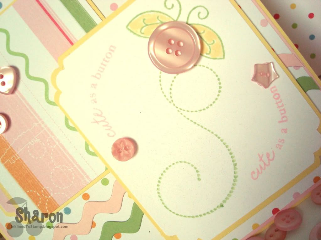
Now on to the card itself.....I've used PaperTrey Ink's Baby Button Bits stamp set for the main image including the "Cute as a Button" saying.  Every image in that set is darling but I choose to go with the bee.  The image is embellished with buttons also from PTI. 

What is hard to see in the pictures is the bit of shimmer mist I sprayed on the focal image to sparkle it up a bit and to help it stand out.  I haven't used my shimmer mist in awhile, but now that I brought it out I was shimmering up a storm on every card I made after this one!!  After all, who doesn't like sparkles on a card?

The other new toy I used here is the ric rac die from PaperTrey.  I love ric rac anyway and this die is a dream to use - cuts through paper like butter with nice crisp edges.  I think it's a perfect touch for this baby card.

And finally, the DP I used is from Little Yellow Bicycle, "Baby Safari" line.  The polka-dot background paper is one of my perky favorites.

Thanks for stopping by!

Sharon

Thursday, April 1, 2010

Backwoods Birthday

Well to start off I've been surfing lots of blogs lately, looking at card photos and layout styles in an effort to improve the interest of the photos I take for my blog.  There is a fabulous tutorial of sorts on photo taking at Becky Oehlers blog that I ran across and learned a few things there.  At least it got me thinking about spicing up my card photos - not sure my new photos here are the best example but at least it's a wholehearted try!  One thing she mentioned was that she touched up every photo she used for her blog.  So that's what I tried with this card photo - not just composition but retouching to max the quality of the image.  Let me know what you think.

Now about the card... This is a High Hopes Stamps image that I colored using my copic markers.  I used the Cosmo Cricket DP "Want S'More?" again.  I thought it was perfect for this back-woodsy image.  I used Stampin' Up paper in Soft Suede, Ruby Red and Mustard which match pretty perfectly with the DP.  A bit of distressing on all the edges and the addition of a few buttons (buttons perk up everything) seems to make the card work for me -- and I hope my coworker who is going to get this for his birthday!  He's sort of the outdoorsy type and should like it just fine.

I'd also like to call your attention to my new photo watermark design.  I ordered this online for $2 at Karen Giron's beautiful blogsite (The Sweetest Thing...).  She has a great selection -- different designs and colors available.  She creates them and emails them to you and I have to tell you she is very quick at processing your order and getting them off.  They are really cute designs and easy to order off her site through Paypal.  She even provides great step-by-step instruction on how to import the image with your photo imaging software.  It was easy peasy to do and I love my new design.  I'll tell you it's a lot faster than typing it in every time - that's my favorite part of it!  You can access the Watermark post on her site by clicking here.  I also have a link in my right side bar to that post. 

Thanks so much for visiting me today.  Please take a few minutes to check out the links to my other creations and to the other blog links where those talented women will inspire you as much as they do me.


Monday, March 15, 2010

To Give You A Lift


I made this card for my dad when he was in the hospital a couple months ago. I loved the paper because it reminded me of colors my dad wears. Both the stripe and pattern papers used here are from S.E.I. and have metallic copper accents that make them glimmery - hard to see in this photograph.

The stamps are from Papertrey Ink - Button Bits. I use this stamp set a lot - it makes a quick image and let's face it, who doesn't love buttons especially when used like this?

The cardstock used is PTI Enchanted Evening (blue), Stamping Up Really Rust and Creamy Caramel. Buttons are Stampin' Up!

Tuesday, September 15, 2009

Balloon Ride - SC245

Just a quick post tonight - it's late because I was participating in the Papertrey Ink September release party tonight and then had to get my order in at midnight!

Made this card for a friend and for the Splitcoast sketch challenge last week -boy am I behind.

The last two weekends I've been either out of town or entertaining family in our home. I did sneak away though to do this card on Saturday morning. It was pure therapy to get back in my "happy place" and stamp a bit.

I've had this PTI stamp set since it was released a couple months ago. I hadn't used this hot air balloon image yet though and have been anxious to use it with the PTI vintage buttons.

I tried to repeat the theme on the inside, only I used circle punches of the DP for the balloons.

Thanks so much for looking!


Recipe:
Stamps: Papertrey Button Bits
Cardstock: SU Razzleberry, Pixie Pink, Razzledazzle DP
Ink: Razzleberry, Curry, Melon Berry
Accessories: PTI vintage buttons, SU circle punches

Thursday, August 27, 2009

Blooming With Buttons

This card uses the layout from the Splitcoast sketch challenge 243 this week. I really had fun with this sketch and with using this darling Cosmo Cricket paper.

I also adore this stamp set "Button Bits" from Papertrey Ink. Buttons on cards are so perky and this particular stamp using the buttons as flowers is divine. I mean who doesn't love flowers - especially flowers made of buttons!

Papertrey offers so many different colors of their vintage buttons and they're such a good value. And they're so pretty in my craft room in the glass jars I store them in! It's eye candy in my room!

Pretty simple card really. Thanks for visiting my blog!

Recipe:
Stamps - Papertrey Ink "Button Bits"
Paper - Papertrey Ink Berry Sorbet and Vintage Cream, Stampin' Up Blue Bayou, Cosmo Cricket Girl Friday DP
Ink - SU Kiwi, PTI Vintage Cream
Accessories - PTI vintage Buttons, Ribbon, Nestabilities Labels 1 dies, Martha Stewart scallop edge punch, Cuttlebug Swiss Dots embossing folder

Saturday, August 22, 2009

Summer Sunflowers

I made this card using the layout from Splitcoast sketch challenge 242. It didn't take me but a second to determine what image I'd use - I'd just received my new Papertrey Ink order in the mail and couldn't wait to get ink on this sunflower stamp!

I stamped in Palette Noir Black and colored the image with my Copic markers. A little sponging to try to anchor the image and then I mounted it on a scalloped rectangle I cut with my Nesties dies from Papertrey's Enchanted Evening blue cardstock.

The background panel is Bordering Blue and stamped with the Aida Cloth background stamp from SU using Enchanted Evening ink (from Papertrey). Other cardstock used is Caramel and Buckaroo Blue - both SU.

I couldn't resist using buttons on this one - I love how buttons are back in style as a design element now. These buttons are from Papertrey - Enchanted Evening Vintage buttons.

Thanks so much for visiting my blog!

Recipe:
Stamps - Autumn Abundance from Papertrey Ink; Aida Cloth background from Stampin' Up!
Paper - Stampin' Up Bordering Blue, Buckaroo Blue, Carmel; Papertrey Ink Enchanted Evening
Ink - PTI Enchanted Evening; Palette Noir Black; SU Caramel
Accessories - PTI ribbon, buttons; hemp cord; Nestabilities scallop rectangle dies; SU scallop edge punch; Cuttlebug embossing folder

Sunday, July 26, 2009

Salad Dressing


I love these stamps from Lockhart Stamps Co.! Dresses fashioned out of vegetables - imagine that!

When I saw the sketch challenge at Splitcoast, I knew these stamps would be perfect for the card design.

I colored the veggie dresses with my Copic markers which are perfect to get the shadowing and color variation on the veggies. I embellished with buttons - perfect fit with the apparel theme!!

Thanks for visiting my blog!

Recipe:
Stamps - Lockhart Stamp Co (Veggie Dresses), Papertrey Ink Polka Dot Basics
Paper - Papertrey Ink Spring Moss and Hybiscus Burst; SU Pretty in Pink, Whisper White
Ink - Memento Tuxedo Black; Copic markers for images
Accessories - Papertrey Ink buttons, twine

Tuesday, July 21, 2009

Hey There Chickadee

The new Papertrey stamps are here - hooray!

Just got my order for this month's Papertrey Ink new release and just couldn't contain myself. Had to get ink on the set used here "Everyday Button Bits". The images are the cutest ever and so easy peasy to whip up a quick card.

I decided to go with the Splitcoast Clean and Simple color challenge using Turquoise, Yellow and Orange. Because it wasn't more specific on what ink to use, I decided on Tangerine, Summer Sun and Papertrey Ink's Aqua Mist.

This stamp set has several images designed to use with buttons of all shapes, plus many coordinating messages. I stamped the chickadee images in tangerine and with my marker and Dove Blender pen embellished the tail feathers of these little chicks a bit more.

For the bird's eyes, I simply used a black brad. The polka dots were stamped using PTI's Polka Dot Basics II - another new set from this month's release. I love polka dots and they're perfect with these little chicks! I did a bit of paper piercing and dots with my white gel pen to finish it off.


Thanks for visiting my blog today! Won't you consider following me by clicking the link to the right? Have a great day.

Recipe:
Stamps - Papertrey Ink Everyday Button Bits, Polka Dot Basics II
Cardstock - Papertrey Ink White and Aqua Mist, SU Tangerine
Ink - SU Tangerine, Summer Sun; Papertrey Aqua Mist, Palette Noir Black
Accessories - Papertrey Aqua Mist vintage buttons, black brads, scallop edge punch, paper piercer