Sunday, July 11, 2010

Tea Time - MMSC61

And now for something completely different than my last post!  From bright colors to softer colors, as well as another challenge I'm trying my hand at.  This card was done for the Midnight Madness sketch challenge #61.  I've wanted to participate in these challenges for some time and now with my vacation I have some time to explore all of them and participate! Boy am I having fun!

For this card I used a sweet stamp from Great Impressions.  I picked this up "free" from my raffle win at the spring stamp show here.  I thought this was perfect for this sketch challenge.  I colored it with my Copics and added a touch of glitter with my Sakura glitter gel pen along the flowers at the top edge of the teacups and teapot.

I also thought these papers went well together and with the finished image.  The DP on the left is from Jillibean Soup called "Egg Drop Soup".  The other paper on the right side of the card is "Ice Cream Parlor" from Doodlebug Design Inc.

I added some lace - newly acquired from my trip yesterday to Joann's. I've long admired the cards embellished with lace and never thought about it when I was out getting supplies - until yesterday.  I am fully stocked and I love the look the lace provides so you'll see more lace from me in the future!
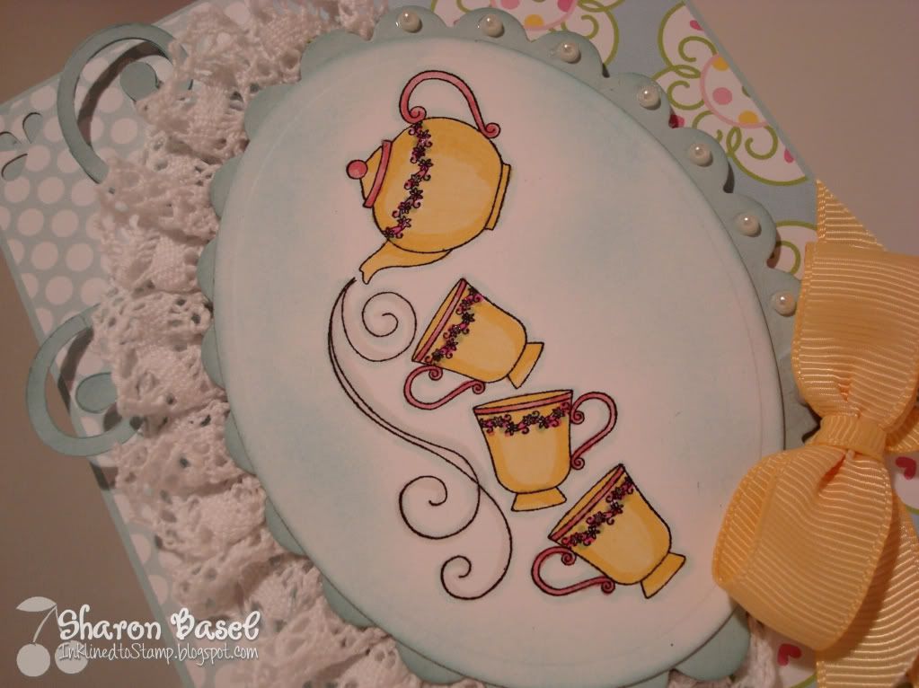
And finally, the last few embellishments to finish off the card include the Sizzlet Scribbles Swirls in Soft Sky cardstock, the half pearls along the scallops on the right of the focal image, the bow and the punched corners using my new Fiskars "Lace" three-way corner punch.

Thanks for taking time to visit my blog.  I hope you're inspired by my creations - I certainly am inspired by yours!


Post edited on Monday, July 12, 2010 - I just looked on the Midnight Madness website and saw that my card "Tea Time" has received one of the Midnight Madness Remarkables awards!  Double wahoo and a happy feet dance!  Many thanks to the wonderful ladies on the design team for the recognition.  I am so grateful and actually quite humbled - there are many very talented and creative crafters that participate in the Midnight Madness challenges.  It's gonna be a great day!

Recipe:
Paper - Jillibean Soup "Egg Drop Soup", Doodlebug Design Inc " Ice Cream Parlor", Stampin Up Soft sky, Papertrey Ink Stamper Select White cardstock
Ink - Palette Noir Black, Copic Markers
Stamps - Great Impressions F360
Accessories - Lace, Nestabilities Ovals and Scallop Ovals, Sizzix Sizzlet "Scribbles Swirls", Fiskars "Lace" 3-way corner punch, half pearls, SU ribbons

Laundry Day - Mojo146

Well I'm having fun on my vacation so far - spending lots of time at the club pool with the kids and in my craft room stamping.  I've finally had the time to work on cards for various challenges - there are a ton of them out there!  

This card is one of those for the Mojo Monday sketch challenge #146.  I thought this was a great sketch and gives me a chance to also break out a variety of my favorite papers and some fun stamps too.

I've used the "Loads of Fun" stamp set from There She Goes.  This set is definitely "loads of fun" - lots of images and some cute sayings to go along with them.  I colored them using my Copic markers (see recipe below). 

The papers were a perfect match with the stamps.  They are all Cosmo Cricket papers: The Boyfriend, Garden Variety and Material Girl.  I just love these papers and their colors - I think it makes for a bright, happy card.  Kind of makes you think doing laundry is fun doesn't it?!!!!!


Thanks so much for stopping by today.  Do you think this card is "loads of fun" ?
Recipe:
Papers - Cosmo Cricket: The Boyfriend (laundry background paper), Material Girl, Garden Variety; Stampin Up Tangerine, Olive, Baja Breeze
Ink - Palette Noir Black, Copic markers (R05,R17,YR31,Y17,YR23,BV23,YG95,G99, BG23,C-1,YG91, R27,R37,R59
Stamps - There She Goes "Loads of Fun"
Accessories - Nesties circle dies

Thursday, July 8, 2010

A Daisy of a Day!

Well this is a daisy of a day!  I found out in the wee hours of this day that my Poppies card (see previous post here) was selected as one of the Fab 4 on the Play Date Cafe Challenge!  I'm so thrilled about the recognition of my work - it took me all of two seconds to get the logo posted on my blog (see left column under awards!)  Thanks to the Play Date Cafe design team and especially Julie Ranae who led the challenge for the team.  I'm very grateful!


Now on to today's post......  This is the second card I've done using the new Friendship Jar stamp set from Papertrey Ink.  I love this set - there are many more "accessories" from the Friendship Jar Fillers set to use with the jar so you'll probably see more in the coming weeks. 

For this card, after stamping the images with Palette Noir Black ink, I colored the image using the new Pebbles Metallic Cream Chalks. That was my first time using this medium and I loved how silky smooth they go on and I like the metallic finish. Hopefully you can see the sparkle that they give in these photos.  I used the applicator provided as well as a blending stump I had for the tighter areas. These chalks provided a subtle color that I really wanted for this image. 

To finish off the card, I layered the image panel on Not Quite Navy cardstock and then on So Saffron - both from Stampin Up.  The base white cardstock is from Papertrey Ink.  The punches for the edge designs were Stampin up and Martha Stewart. 

Thanks so much to all of you that take the time to visit my blog and comment on my work. I truly appreciate that - it makes for a daisy of a day and puts a smile on my face!

Monday, July 5, 2010

Poppies, Poppies, Poppies!

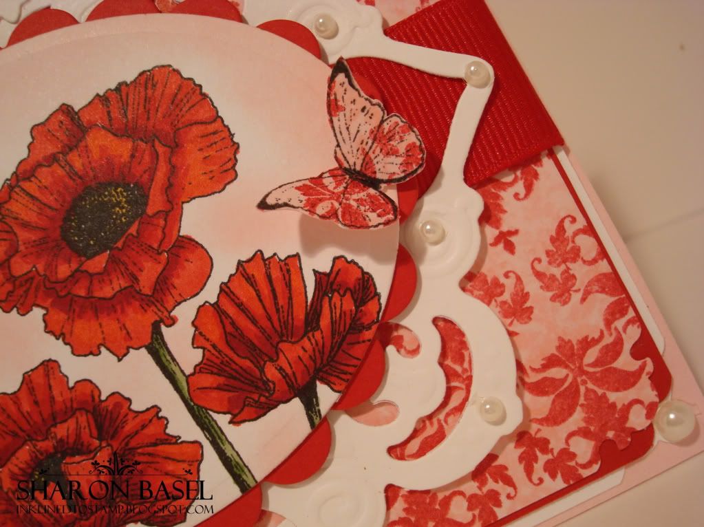
 This "Poppies" card was made for the Play Date Cafe Challenge #36 using There She Goes stamp set.

If you can't tell with your visit here to my blog, I love the combination of red and pink! So when I saw the Play Date Cafe challenge this week to use red, pink and white it was right up my alley and I knew instantly I had to play! 

I started with these gorgeous poppies from the There She Goes "Poppies" stamp set.  I adore poppies because of their beautiful color and this stamp set, designed by Chris Dark, is fabulous.  I loved coloring these flowers with my Copics!  I used R27, R37 and R59.  The main image panel background was sponged with Stampin' Up Pink Pirouette ink and then cut out using Spellbinders oval dies.  The SB scallop oval dies were also used with Papertrey Ink Pure Poppy cardstock. 


I created my own designer paper for the background panel using Papertrey Ink's "Damask Designs".  It started with Pink Pirouette cardstock and ink, stamping the design repeatedly.  Then I went over it - slightly offset with PTI Pure Poppy ink (I know...poppies everywhere!). I just thought the pink in the background would give it some depth. The corners were punched with Fiskars "Heritage" corner punch and then the panel layered on the Pure Poppy cardstock and then on SU Whisper White.  All that was mounted on Pink Pirouette cardstock.

For the white filigree layer, I used Spellbinders Shapeabilities Pendants dies called "In Spades".  I layered two of them to achieve this effect.  Some red grosgrain ribbon that I had was threaded through and under the image panel.

A final touch was stamping the butterfly image from the same "Poppies" stamp set onto the scrap of the background paper I created.  I stamped two, cut them out and adherred them with small pop dots on to the main focal image.  The last embellishment was adherring the half pearls around the white filigree panel and in the corners of the card.

I like how this turned out - I mean, really, who doesn't love red and pink together?!!  Tell me what you think...

Thanks for stopping by!


Update to this post on July 8, 12:26 a.m.:   My "Poppies" card made the FAB 4 at the Play Date Cafe!  Thanks to the Design Team for the recognition!  Wahoo!

"The beginning of the summer holiday..."


This is the perfect card right now as I have officially begun my two week vacation!  Or as the DP says.... "This was the beginning of the summer holiday...."  I did this card for the Splitcoast sketch challenge #287.

  First, I fell in love with this Lockhart stamp.  It just spoke summer to me - don't you think Adirondack chairs are totally a symbol of summer?  This is one of the stamps I picked up when I won that raffle at the stamp show in the spring! 

I colored the image in off-white, pale blue and greens using Copic markers and it coordinated wonderfully with these papers.  The word paper is by October Afternoon called "Sprinklers" and the other two are Basic Grey from the "Kioshi" collection.  I loved this word paper - and I thought it was a perfect pairing with the stamp image here. 

To add a little more dimension and texture to the focal image, I used Flower Soft as part of the grass and as a few of the posies in the flower pot to make those areas pop a bit more.  All in all I'm pleased with this card overall - wish you could see it in person as the colors are a little more intense but still are soft.

Thanks for taking the time to visit my blog today! 
 

Sunday, July 4, 2010

God Bless America!


Happy Fourth of July bloggers!  This is a very quick post of a card I  whipped up for the holiday using Stampin' Up's "July Fourth" stamp set and the coordinating "stamping around" wheel.  I usually remove the rubber stamp from the wheel (a trick my friend Emma taught me) because its so much easier to use as a regular stamp (I just never can get the right ink coverage or details where I want them otherwise).

On this card I also used the Cuttlebug stars embossing folder. 

Here's hoping that everyone has a safe and relaxing holiday with friends and family.  Enjoy your day and thanks for taking time to peek in at my blog!

Happy stamping!
 

Saturday, July 3, 2010

Tulip Trellis


Just a quick post today on a card I quickly put together using a Lockhart stamp I was playing with. I colored the image using my Copic markers - a bit more challenging than using Prismacolor pencils on this image!


I chose the colors for this card on what, in my eye, made the focal image and colors pop more.  Not sure I'm satisfied with it - that is all but the image itself (I do like how that turned out!).  Let me know what you think.

Thanks for stopping by!

Tuesday, June 29, 2010

Garden Variety - SC286

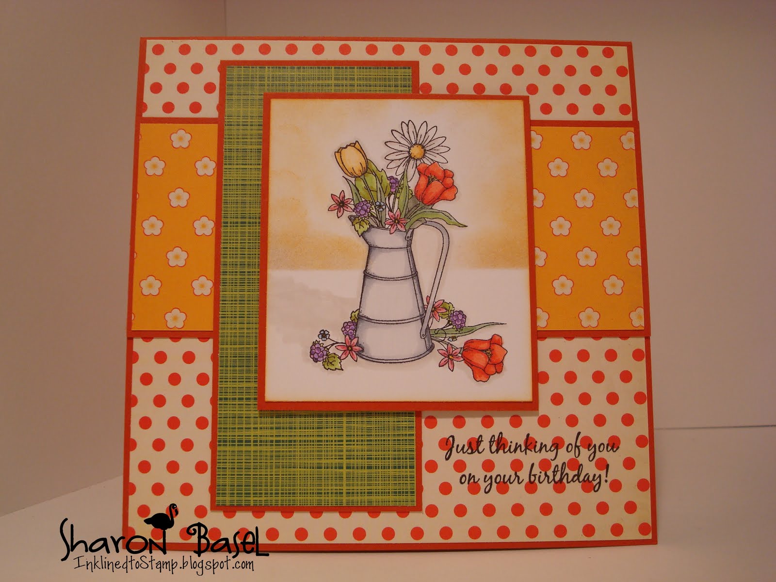
I haven't played in the Splitcoast sketch challenge in a long time until this card.  I had some extra time this weekend to stamp and make several cards - experimenting with some stamps that haven't seen ink before!  I saw the sketch at SCS and thought it would be perfect for this image I had just finished coloring with my Copic markers.

I didn't color the image to coordinate with the papers I used but I think they work just fine.  The papers are Cosmo Cricket "Garden Variety" and I just love every one of them.  And I love this sketch.  What do you think?

Thanks for visiting today!
Recipe:
Stamps:  Great Impressions, Stampin' Up "On Your Birthday" (Sentiment)
Paper:  Cosmo Cricket "Garden Variety", Papertrey Ink Terracotta cardstock
Ink:  Pallette Noir Black, Copic Markers

Saturday, June 26, 2010

Friendship in a Jar


The last stamp release at Papertrey Ink was fabulous.  When I saw this set revealed during the countdown my heart jumped a beat.  From there the release date couldn't come fast enough and then the snail mail couldn't be slower it seemed.  Well I got the "Friendship Jar" set this week and I've been itching to get going with it.  This is my first project using this wonderful set.

My vision from the moment it was revealed was to use real fabric for the jar lid - so that's what I did here.  I pulled this blue and turqoise fabric from my fat quarters stash because I thought it would coordinate so well with the coloring I did on the jar.  My vision for that was the old aqua glass canning jars of yesteryear.

I started by using the coordinating jar and lid die from Papertrey to cut out the images - one die cuts the jar and the lid.  The image was then stamped with Pallette Noir Black and colored with my Copic markers, using BG10 for the glass.  Colors C1, C3, C5 were used for he lid.  I also used the coordinating dies to cut out the fabric.  I did it in the same manner as you would for cardstock.  The dies cut well through just about anything.  I adherred the fabric to the jar with Scor-Tape and did the same with lid on top of the fabric.  The jar label was done in a similar manner, again using the coordinating label die for this set.  I stamped the outline in PTI Smokey Shadow and then the "my friend" image in SU Brilliant Blue - this color worked best with the fabric.

For the background panels I used my Nesties Label 1 dies.  I left the die attached with the white cardstock and then stamped the polka-dots, also in Brilliant Blue, with it still in the die.  The result is the white border edge on that panel.  And then the best of all, I used the same Nesties to die cut my fabric for the other layer and it worked great!  Yes that is fabric, not designer paper!

The base panel is SU Cool Carribean cardstock that I sponged the edges with Night of Navy ink and stamped with Cool Carribean the floral image from Stampin Up's "Charming" stamp set.  Night of Navy is the base card color.  I embellished with a few PTI vintage buttons (Hawaiian Shores) on the fabric panel to finish it off.

I like this color combination and of course I love the stamp set.  Lots of other projects in works with these stamps - stay tuned! 

Thanks for stopping by!

Thursday, June 24, 2010

Gordon - High Hopes Challenge #81

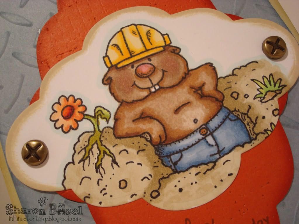
This is one of my favorite High Hopes stamps. The little critter's name is Gordon.  Doesn't he just crack you up?!  I had decided to use Gordon on the Dad's Day card I made for my son to give to my hubby since their bellies look about the same!!!!  This also meets the High Hopes Challenge #81 which is "anything goes". 


I started by coloring my friend Gordon with my Copic markers and he is a fun one to color (most of the High Hopes stamps are).  I used my Spellbinders Nestabilities Labels 6 dies to cut out the image and sponged the edges with Tim Holtz' "Old Paper" distress ink. 

The Terracotta layer (Papertrey Ink cardstock) was also created using the Nesties Label 6 dies and then distressed using Papertrey Ink's impression plate "linen and canvas".  The sentiments are from Amuse stamps.  I used Stamping Up's Bordering Blue paper for the back panel, embossed the texture from a Cuttlebug "diamond plate" embossing folder and sponged the edges with the same color ink. The card base is SU River Rock cardstock.

You just can't help but smile at Gordon and his teeth and belly.  Hope you like this stamp and card as much as I do.  Thanks for stopping by my blog!

Sunday, June 20, 2010

Dad's Day


Here's hoping that all the Dads out there had a wonderful Father's Day and were appropriately pampered and adored by their kids.  Unfortunately, my dad was up north for the weekend and I wasn't able to join my folks at the lake.  It was a busy weekend at home with baseball playoffs (successful I might add) and other odds 'n ends!


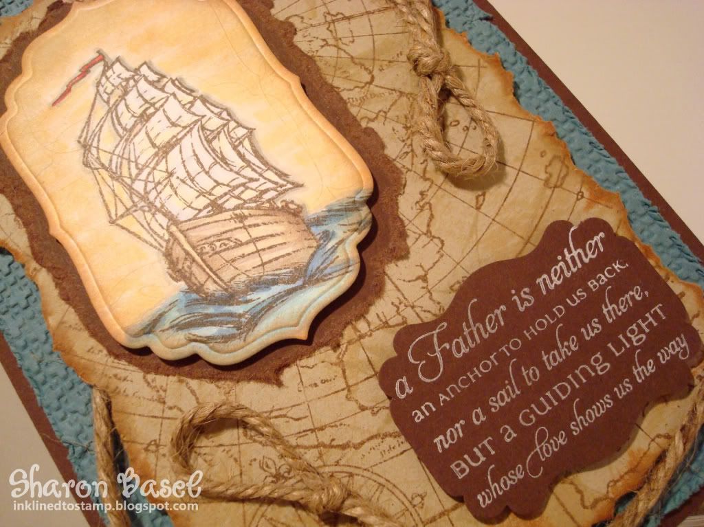
This is the card I made for my Dad using the new "Guiding Light" and "Antique Map" stamp sets from Flourishes.  These are wonderful sets - perfect for the nautically inclined!

I started by stamping the map with Cocoa ink on Kraft cardstock from Papertrey Ink.  I tore the edges to get the shape and size (this card is about 5x7 inches) and then distressed using Tim Holz Tea Dye, Old Paper and Antique Linen distressing inks.  I curled the edges by rolling them up around a pencil.  The Blue Bayou layer was embossed using the newer Stampin Up' embossing folder and then the edges were distressed. 

The sail boat was stamped on PTI white cardstock and colored using my Copic markers and then cut out using Spellbinder's Label 4 dies.  Again, the brown cardstock underneath the image was just torn to get the size and shape.  The message panel was punched out after stamping in SU white craft ink with an EK Success label punch.  I used a heavy gauge twine around the card, strategically secured with glue dots.

I'm pretty happy with how this turned out for my Dad.  I'm sure he'll love it too.

Let me know what you think!  Thanks for stopping by my blog today!

Sunday, June 6, 2010

Just Peachy - PDCC32


There are challenges and then there are real challenges where you really rack your brain as to how to make a card with the given parameters.  Well this was one that really threw me for a loop.  It's the Play Day Cafe Challenge 32 where the colors are Lemon, Light Peach and Peach. 

 I would probably never put these colors together if it weren't for this challenge.  But now that I see the card in photos the colors look pretty good together - it belies the effort I put in to make it work for the PDCC!

To start I used Papertrey Ink's Lemon Tart and Melon Berry and Stampin' Up's Blush Blossom card stock.  I also looked through my stash of DP and found a half sheet of the SU DP that I used.  It's retired paper and I have no idea what the pattern name is but it happened to work perfectly to tie in the peach colors.

I had the idea that the colors might look good as gradient colors in the background of something - kind of like a summer sunset would look.  So that was my inspiration to kick it off.  To achieve that look, I decided to use my new dotted postage stamp image from Just For Fun rubber stamps. 


 I have several of these collage type stamps but I chose the "honeycomb" one since it was in harmony with the background DP that I picked.  I used inks that matched the cardstock and brushed them on with a stipple brush, starting with the Lemon Tart and ending with the Melon Berry, until it looked like a sunset.  The Just For Fun stamps like this come with a vinyl template that perfectly fits over the dotted lines which explains how you get the white borders.

With the background complete, I used a bit of Mellow Moss ink with a french  script stamp (also from Just For Fun) and ever so lightly stamped it in the background of each opening.  Then I used Stampin' Up's "Inspired by Nature" stamp set in Chocolate Brown to stamp the coneflowers - a couple of them were stamped off first for some variation.  When complete, I cut out the image using my Fiskars postage stamp decorative scissors.  The image and the background DP were distressed using tim Holz Tea Dye distress ink.  I added some half pearls in yellow and Lemon Tart grosgrain ribbon.  The words in the bottom right corner are from SU's "Great Friend" stamp set and stamped in Chocolate Brown ink.

Though I wouldn't have put these colors together on my own, this was a great challenge and I really like how the colors work together.  I just might have to try this again!  Let me know what you think...

Thanks for stopping by my blog....why don't you visit the Play Date Cafe Challenge site by clicking on the link here!
 

Saturday, June 5, 2010

Whimsical Birthday


I enjoyed my Saturday in my craft room - first cleaning it up and reorganizing my stamps and supplies, then trying my hand at some techniques that I learned at a local stamp show several weeks ago.  This card is one of those.

To start, I pulled out my new stamps from Art Gone Wild..."Birthday & Sweets" and the "Square Clear Set".  The images are about 1 inch square and colored with my Stampin' Up markers.  I sponged the edges a bit with Regal Rose ink.  I stamped the dotted squares on SU "Tea Party" paper and then punched them out using my SU scallop circle punch - centering the square within the outer edges of the punch.  I then scored on the lines and folded up the edges to frame the images.  In another version of the same DP paper set, I punched 2" scallop circles with a Paper Shapers punch and then mounted the centers on them.  I just used a little 1/4-inch celery grosgrain ribbbon to act like flower stems and leaves.  The card base and background panels are in Pretty in Pink, Celery and Tea Party DP. 

Pretty easy and a whimsical look I like.  What do you think?

Thanks for stopping by today.

Sharon

Tuesday, June 1, 2010

Dad's Birthday


Well I've squeezed out about as much as I can from the holiday weekend and a couple days of vacation.  It's back to work for me tomorrow so I'll do this quick post before I call it a day. 

I did this simple card for my Dad using Papertrey Ink's "Enjoy the Ride" stamp set.  These stamps are perfect for paper piecing and I thought it would be fun to do a plaid car for a change!  Years ago, there was a plaid car shown by GM in a charity event where the company partnered with the fashion industry.  Top line designers took GM vehicles and redesigned them in their style.  Cynthia Rowley was one of the designers and her car design included a plaid paint finish very close to this plaid actually.  I thought about that as I was making this card!

In this case, however, the coordinating plaid and abstract papers were designed by A2Z Essentials called "What's New Club".  The cardstock used is Papertrey's Spring Moss.  I used Palette Noir Black ink for the stamped image on the cardstock and on the plaid paper for the piecing.  I also used a gelly roll glitter pen to accent the bumper and headlamp rings.

That's it - simple but colorful and fun.  Dad liked it and my story about the real plaid car by Cynthia Rowley!

Thanks for stopping by!

Sharon