Wednesday, May 26, 2010

Smallish Things


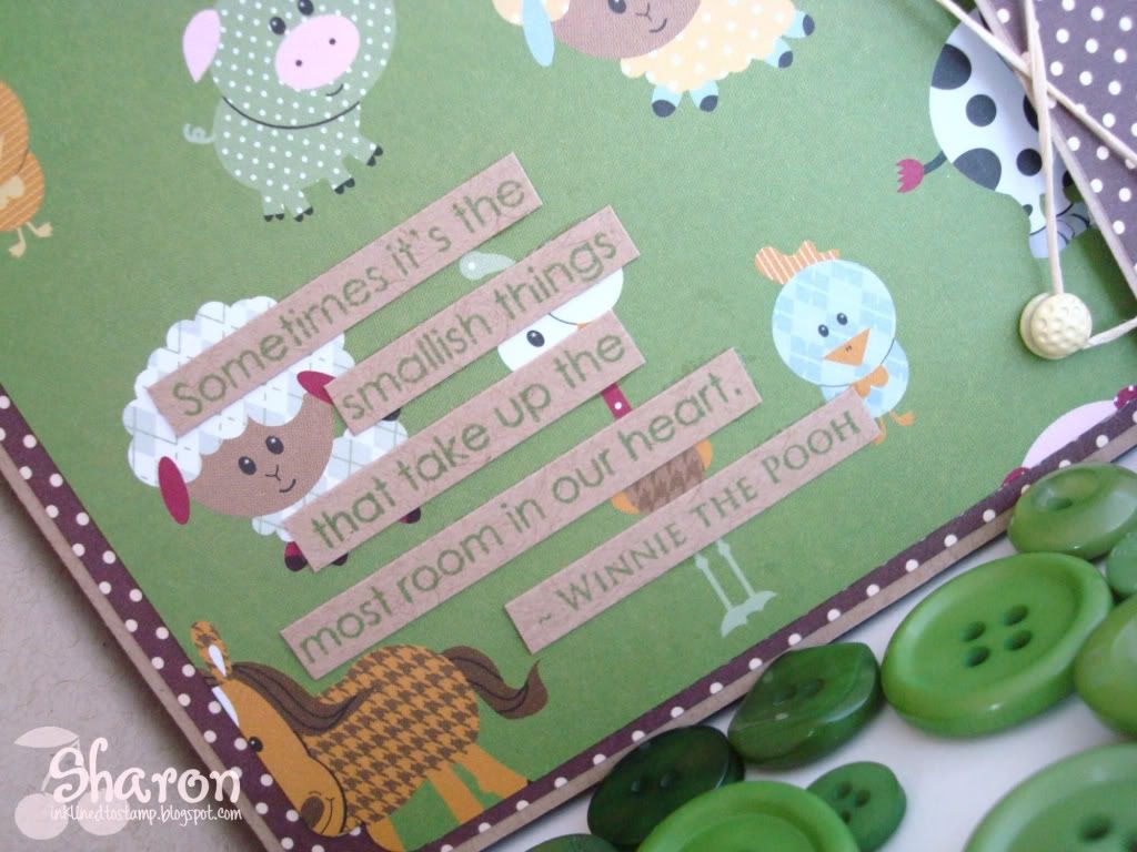
Here's another baby card I recently did featuring a scrapbook paper that I just couldn't resist for a baby boy.  This paper is from TaDa Creative Studios called "Green Pastures".  The paper was too perfect to cover up with stamped images so I choose to use it as the focal point of the card.  I also paired this with October Afternoon's "Picnic Table" chocolate and cream dotted paper.

Because I wasn't adding much in the way of stamped images, I knew the layout or overall card design had to be different.  So, to create that interest I made this card larger (about 5x7) and with a flap where I used some special brads specifically for "laces" like on shoes.  I just used some simple natural scrapper's floss to lace the card up and keep it closed. 

Also on the front panel I cut out the sentences of a stamped image from PaperTrey Ink's "Inside and Out: Baby" set and pieced it out separately so it would fit and wouldn't obstruct from the main image paper.

On the inside, I used another large panel of the "Green Pastures" DP because I just couldn't get enough of it in this card!  Then made a message panel on PTI's Kraft cardstock on top of the brown dotted paper to carry the theme inside.

I think this makes a cute baby boy card - what do you think?

Thanks for visiting my blog today!

Sharon

Sunday, May 23, 2010

Baby Bee - Play Date Cafe Challenge 30


This was a quicky card for a baby gift of a coworker using a couple supplies that I've been waiting to play with but haven't quite found the time until today.  I'm also entering this card in the Play Date Cafe Challenge 30 because the focal colors I've used in the card are a match for this week's PDCC.  Thanks so much to Julie at Julie's Open Window for bringing this to my attention and getting me interested in this weekly challenge! (Need inspiration? - go to Julie's blog and see her amazing creations. They are gorgeous works of art.)  Here's the link to the Play Date Cafe Challenge blog.  And here is the inspiration for the colors specified in this week's challenge:


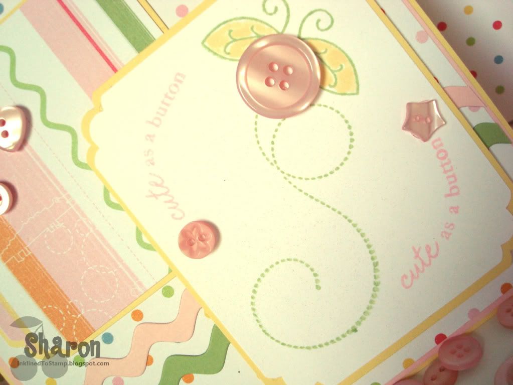
Now on to the card itself.....I've used PaperTrey Ink's Baby Button Bits stamp set for the main image including the "Cute as a Button" saying.  Every image in that set is darling but I choose to go with the bee.  The image is embellished with buttons also from PTI. 

What is hard to see in the pictures is the bit of shimmer mist I sprayed on the focal image to sparkle it up a bit and to help it stand out.  I haven't used my shimmer mist in awhile, but now that I brought it out I was shimmering up a storm on every card I made after this one!!  After all, who doesn't like sparkles on a card?

The other new toy I used here is the ric rac die from PaperTrey.  I love ric rac anyway and this die is a dream to use - cuts through paper like butter with nice crisp edges.  I think it's a perfect touch for this baby card.

And finally, the DP I used is from Little Yellow Bicycle, "Baby Safari" line.  The polka-dot background paper is one of my perky favorites.

Thanks for stopping by!

Sharon

Sunday, May 16, 2010

Heide's Birthday

This card is for my dear friend Heide.  We had such a good time on her birthday with the rest of the gals from our stamping club.  We all spent the day at the StampScrapArtTour rubber stamping show - spending up a storm on new stamps, embellishments and gotta have "toys".  It was such fun!  And to top it off, I ended up winning a $100 gift certificate at the show!  I couldn't believe it -- and of course I didn't have any trouble spending it either, LOL!

For this card I used a new stamp from Hero Arts.  I really like this bicycle stamp.  I inked it up using my Stampin' Up markers in Mambo Melon, Soft Suede, Black and Razzleberry.  I added a touch of Curry on the pedal gear and the basket. 

In the basket, I thought it would be cute to fill it with flowers so I used my Flower Soft "Spring" and it really makes it pop.  From there the image was cut out using my Spellbinders Labels 4 dies.  The background paper is Basic Grey "Green at Heart" and the cardstock used is Soft Suede and Melon Mambo also from Stampin' Up.  I just added some free-hand doodles with a white gel pen around the soft suede image panel - an idea I picked up from the stamp show we were at today.

So that's it at the end of a wonderful day with my dear stamping friends and BFF Heide on her birthday.

Thanks a bunch for stopping in and visiting my blog today.  Let me know what you think...

Sharon

Monday, May 10, 2010

New Blog Design

Just a quick post introducing my new blog design.  I actually did this myself with a little help from Shabby Miss Jenn Designs...an incredible site on the web for blog design kits and digital scrapbooking kits.  I actually used both in doing this blog.  The blog design kit is called "Posies" and the digital scrapbooking kit is called "Summer Posies" which I have pictured below. 


What I like about the blog kits to start with is that they provide the header banners - ready for customization like I did here.  However, you usually don't get all the unique complimentary letters nor as many do-dads to embellish or the selection of background papers.  That's where the digital scrapbook kits are wonderful. 

For my blog, I used the red polkadot paper and embellished with the green ric-rac and the cherries do-dad from the scrapbook kit and created the blog background in my photoshop program.  For the blog header, I used the non-photo header provided in the blog design kit and embellished it with the polkadot letters from the scrapbook kit.

I am by no means an expert on this - blog codes or photoshop - but there is a wealth of info on the web and the instructions in the blog kit by Shabby Miss Jen are clear and understandable.  So even a novice can do it.

Stop by and take a look at the Shabby Miss Jen Designs shop - your mouth will water with all the goodies you'll find there.  And, you can find a link to Miss Jen's blog where she showcases so many beautiful samples of her scrapbook kits and blog designs in use.

Leave me a comment on what you think - and thanks for stopping by!


Wednesday, April 7, 2010

Happy Spring

I am so glad Spring is here.  Even though this winter seemed to fly by and wasn't that bad, I am still loving the bit longer days, warmer and sunnier weather where you can get out and walk around.  I couldn't think of a better Spring card than this one using my new favorite stamp company's - There She Goes - stamp set called "Tweeterpated". 

This is a perfect set for paper piecing which is what I did here using current and retired DP from Stampin' Up.  I thought the combination of these papers were perfect and interesting together even though they weren't released together.  The image panel was cut out using Spellbinders large scallop oval dies. I also thought the Tangerine and Saffron cardstock were perky together - just how I'm feeling these first days of Spring!

I used Stampin' Up's new scallop edge punch which I just love.  This was my first crack (pun intended) at using this punch with the matching corner punch and having it turn out decent.  I learned some tricks from following a video tutorial on creating perfect scallop edge rectangles by Julie Buhler on her blog Paper Pleasing Ideas.  This is a really helpful tutorial - thanks Julie!

Here's wishing you a Happy Spring and thanks for stopping by.


Monday, April 5, 2010

Easter Blessings

Just a quick post today with two of my favorite Easter cards that I made for my family.  The first one uses this wonderful rabbit image that I got nearly a year ago from a stamp show.  It's from Stacy Stamps and was new to their line last summer.  I colored the image using my Prismacolor pencils and gamsol to blend them.  I paired this with the beautiful DP called Old Fashioned Eggs from Karen Foster papers. 

The rabbit image was mounted on the vanilla cardstock that was cut out using the Top Note die from Stampin' Up that I first stamped with a script stamp and then distressed using Tim Holtz Distress Inks in Tea Dye and Antique Linen.  I also used a bit of Regal Rose in the distressing to pick up the subtle pink tones in the DP.  The background and accent cardstock is SU True Thyme.  SU and EK Success punches were used on the Thyme bands that run across the card and the greeting panel.  Papertrey Ink Melon Berry ribbon and buttons were also used.


The second Easter card uses the adorable "Chocolate Bunny" stamp from Stampin' Up.  I made this card for my niece Olivia who is a choco-holic to the max.  I knew she'd get a kick out of the stamp - she's a little stamper herself and of course I endorse and promote that with stamps, inkpads and cardstock as gifts to her.

The chocolate bunny was stamped in Chocolate on Close to Cocoa cardstock and distressed a little with Caramel and Cocoa ink (which is hard to see in this photo).  It was mounted onto paper where I had stamped the grass from SU "Inspired by Nature" in Celery and Mellow Moss.  The rest of the background was lightly sponged with Bashful Blue.  The eggs were cut from an older DP from It Takes Two.  I framed the image using Spellbinders Classic Frame die cut from Basic Grey's Green at Heart paper.  The other cardstock used is Celery, embossed with Cuttlebug Swiss Dot embossing folder and PTI's Plum Pudding cardstock.

Hope you all had a wonderful Easter and I thank you for stopping by my blog.

Thursday, April 1, 2010

Backwoods Birthday

Well to start off I've been surfing lots of blogs lately, looking at card photos and layout styles in an effort to improve the interest of the photos I take for my blog.  There is a fabulous tutorial of sorts on photo taking at Becky Oehlers blog that I ran across and learned a few things there.  At least it got me thinking about spicing up my card photos - not sure my new photos here are the best example but at least it's a wholehearted try!  One thing she mentioned was that she touched up every photo she used for her blog.  So that's what I tried with this card photo - not just composition but retouching to max the quality of the image.  Let me know what you think.

Now about the card... This is a High Hopes Stamps image that I colored using my copic markers.  I used the Cosmo Cricket DP "Want S'More?" again.  I thought it was perfect for this back-woodsy image.  I used Stampin' Up paper in Soft Suede, Ruby Red and Mustard which match pretty perfectly with the DP.  A bit of distressing on all the edges and the addition of a few buttons (buttons perk up everything) seems to make the card work for me -- and I hope my coworker who is going to get this for his birthday!  He's sort of the outdoorsy type and should like it just fine.

I'd also like to call your attention to my new photo watermark design.  I ordered this online for $2 at Karen Giron's beautiful blogsite (The Sweetest Thing...).  She has a great selection -- different designs and colors available.  She creates them and emails them to you and I have to tell you she is very quick at processing your order and getting them off.  They are really cute designs and easy to order off her site through Paypal.  She even provides great step-by-step instruction on how to import the image with your photo imaging software.  It was easy peasy to do and I love my new design.  I'll tell you it's a lot faster than typing it in every time - that's my favorite part of it!  You can access the Watermark post on her site by clicking here.  I also have a link in my right side bar to that post. 

Thanks so much for visiting me today.  Please take a few minutes to check out the links to my other creations and to the other blog links where those talented women will inspire you as much as they do me.


Wednesday, March 31, 2010

Flower Garden

This was a fun card to make and pretty quick to put together.  I loved this DP by Making Memories (Vintage Findings) for the bright colors, texture and glossy finish (which was hard to photograph without the flash creating hotspots).  Because the DP is so bold, it really didn't need much in terms of a stamped image so I selected Papertrey Ink's "Garden of Life" set for the floral images and for the butterfly.  I thought these flowers coordinated well with the flowers in the paper.

I used the rock n' roll technique for stamping the flowers to add some depth and interest to the images and try to pick up the same colors.  For the butterfly, I used a Martha Stewart butterfly punch with the same flower stamped image.  I coated it in Versamark and then heat embossed using SU Irridescent Ice EP to sparkle it up.  I used my Nesties Labels 9 dies to cut out the image panel and then distressed the edges with SU Soft Suede ink.  Both Stampin' Up and EK Success scallop border punches were used to edge the top panels in Bermuda Bay and Soft Suede SU In Colors.  I finished it off with Regal Rose ribbon to pick up the pink in the DP. 

Thanks for peeking in to view my creations!

Monday, March 29, 2010

Flutter By Butterfly

This is a quick birthday card I made up for a friend at work.  My inspiration for the colors was taken directly from the DP - Basic Grey's Indian Summer series.  The three main colors are Stampin' Up In Colors - Rich Razzleberry, Curry and Dusty Durango.  Before adherring my elements to the Razzleberry cardstock, I spritzed the card with a mix of SU champagne shimmer paint with 70% alcohol.  You can see a bit of the shimmer that gave to the base card.  I used this on the butterfly images to add a bit of sparkle there too.


The butterfly stamp is from SU Great Friend and I stamped it on the inner color ink first (from top: Curry, Durango, Melon Mambo) and then rocked and rolled the edges on the Razzleberry inkpad before stamping on Whisper White cardstock.  I punched the butterflies out using my SU square punch but using different angles for some interest so they looked like they were fluttering by.  Each butterfly square was then mounted on Durango cardstock and popped up with dimensionals.  The Curry cardstock was punched using a Martha Stewart punch which I thought coordinated really well with the DP design.

Thanks for fluttering by my blog!  Leave a comment and let me know what you think.

Candy Anyone?

Doesn't this just make your mouth water?  It should - especially if you're a Cosmo Cricket fan like me.  Just look at all that paper and the buttons - who doesn't love buttons?  Well now is the time to head on over to Kadie's In My Minds Eye Creations blog to get the details on how to win this wonderful candy (that is if I don't win it first!).  Just click the link I provided and it will take you there.  The winner will be chosen April 22.  Oh and while you're there, take a peak at the pretty cards Kadie has posted.  She's a very talented lady.

Saturday, March 27, 2010

Squirrel!

The peanut gallery at work will love the title of this blog post - it'll remind them of the dog "Doug" in the movie Up.  But you're not here for that....let's get on to the card!

I have to admit that I made this card last fall and have never posted it.  Such a shame because I like this card - something to do with the colors and the coloring of the image itself.  The image is a digital stamp from Mo Manning's creations that can be found here.  I love her work and this one is a favorite of mine. 

I started by coordinating the Copic marker colors for the image with the background paper that I wanted to use from Cosmo Cricket.  I use my Spellbinders Nestibilities dies to cut out the image and the background panel. 

Thanks for taking a peak at my work!

Thursday, March 25, 2010

Good Grief Charlie Brown

My brother loves all things Charlie Brown and Snoopy so I grabbed this stamp knowing I'd use it in a card for him.  I colored the image using my Copic markers and cut it out using my Nestibilities Labels 2 dies.  For the background polka-dot panels, I stamped them using a background stamp from a My Favorite Things stamp set and also randomly colored in the dots with the same copic markers as the main image panel.  The color background panel was embossed with a Cuttlebug folder.  The cardstock is all Papertrey Ink.

Thanks for looking!

Wednesday, March 24, 2010

Jeans Day

I made this card for a co-worker's birthday who always appreciates my handiwork.  When he got this one he remarked that I always make the "coolest cards".  He framed the card I gave him last year for his son's room - it was a Detroit Tigers themed card. 

Well this year I went for a jeans theme.  This is one of my favorite stamps from Judikins.  I stamped it using SU Buckeroo Blue ink on Buckeroo cardstock and stamped it twice.  The second one I used to cut out the pocket only and mounted it on the other stamped image and punched two brads at the top corners of it.

For the hankerchief, I used a SU paisley stamp on Real Red cardstock and embellished it with my white gel pen.  The twine belt was threaded through the belt loops by cutting small slits on each belt loop sides.  The word stamp is from AMuse.

I dressed up the inside by using another pocket with a tag insert that says have a great birthday.

Thanks for stopping by!


Stamps:  Judikins "Jeans 1701J", AMuse
Cardstock:  SU Creamy Caramel, Real Red, Buckaroo Blue; PTI Enchanted Evening
Ink:  SU Buckeroo Blue, PTI Enchanted Evening

Sunday, March 21, 2010

Trendy Trees

Just a quick post with a card I did a couple months ago for a colleague that was retiring.  The DP is Cosmo Cricket "Want S'More?" and I love this paper from the moment I saw it.  The colors are my favorite thing but it's also a great paper for guy cards, which this was.  I also thought Stampin' Up Trendy Trees stamp set went perfectly with the paper.  I like that set too - quick and easy to put a card together with these stamps and the paper.  To add a bit of interest without using ribbon and other girly accessories, I stitched around the edge of the main panel of the card and the image panel.  Thanks for stopping by my blog!

Stamps:  SU Trendy Trees, AMuse Happy Retirement
Paper:  SU Mellow Moss, Ruby Red, Close to Cocoa, Cosmo Cricket
Ink:  SU Mustard, Ruby Red, Cocoa, Moss
Accessories:  Rhinestones, Corner rounder punch

Thursday, March 18, 2010

Got Milk?


I crack up every time I see this digital image from Mo Manning. Isn't he the cutest with his cheeks so puffy with all the food in them?

There are so many darling digital images from the talented Mo at Digital Pencil Too, her online store.

I never thought I'd like digital stamps but I really like them for several reasons - you can size them to whatever size your project calls for, you can instantly use them after you download them with no waiting for that pesky mail. (Really I'm not that impatient - only when it involves new stamps or card making supplies!)

This image was fun to color using my Copic markers. I cut out the image and layered them on the card. To make the little critter stand out, I colored a second image of him and cut out the top half of his "body" and popped it with a dimensional.

The cardstock and pattern papers are all from Stampin' Up.

Thanks for stopping by!

Wednesday, March 17, 2010

For My Hilly


This digital image from Mo Manning is a totally accurate depiction of my daughter Hilary (Hilly). So when I saw this I knew it would be perfect for her.

I just love the carefree, relaxed, day-dreamy look. I can imagine the words "whatever..." rolling off her lips like my Hilly says when absorbed in her own important thoughts!

I colored the image with Copic markers and edged the image panel with my copper metallic marker. The background swirls are Papertrey Ink as well as the embossed daughter stamp at the bottom. Stampin Up cardstock was used - Bordering Blue, Creamy Caramel and PTI Enchanted Evening blue.

Thanks so much for visiting my blog!

Monday, March 15, 2010

To Give You A Lift


I made this card for my dad when he was in the hospital a couple months ago. I loved the paper because it reminded me of colors my dad wears. Both the stripe and pattern papers used here are from S.E.I. and have metallic copper accents that make them glimmery - hard to see in this photograph.

The stamps are from Papertrey Ink - Button Bits. I use this stamp set a lot - it makes a quick image and let's face it, who doesn't love buttons especially when used like this?

The cardstock used is PTI Enchanted Evening (blue), Stamping Up Really Rust and Creamy Caramel. Buttons are Stampin' Up!

My Wonderful Grandmother


I just had to post this picture of my Grammy who just turned 90 years old last month. All her grandchildren surprised her by gathering together in Florida for her birthday.

I hope I have her genes - doesn't she look great?!

Sunday, March 14, 2010

Celebrating Jenny


So, last night I practically pulled an all-nighter working on updating my blog look. I found this wonderful background and template from Leelou Blogs - I just love it. It comes with the post separators, header, layout and design and was very easy to install.

So while I was on a blog-roll, I thought I'd upload several cards that never made it out of my camera. And this card is one of them.

I made this card for my sweet niece Jenny and it reminds me of her. There is a picture of her sitting like this with "Grandpa" when she was younger. She was just the cutest darn thing. So when I saw this stamp from High Hopes, I thought it was perfect for the occasion.

I colored the image with my Copic markers, cut it out, along with the other High Hopes images used here, then popped them with dimensionals.

Jenny really appreciates the cards I make and I don't think this one disappointed her. Love you Jenny!


Sunday, January 3, 2010

Happy Birthday Mom

Today is my Mom's birthday and I made this card for her. Lots of detail and layers on this one.

I first saw this technique on the Flourishes blog from the Limelight Designer for December, Yvonne. She is one talented stamper - I've been following her blog (Yvonne's Stamp, Paper and Ink) for a while. The most beautifully creative cards I've ever seen. Yvonne is an expert in creating with Spellbinders dies and when I saw what she did with the Spellbinders Classic Frame I put them on the top of my Christmas list because I knew I wanted to create that design for my Mom's birthday card.

The link to Yvonne's tutorial for this design is here.


For the image I used Papertrey Ink's "In Bloom" stamp set, stamped in PTI Smokey Shadow ink and colored using my Copic Markers.

Thanks so much for looking!

Happy Birthday Mom!!!

Recipe:
Stamps - Papertrey Ink "In Bloom", Sweet Impressions Stamps for the sentiment; Stampin Up "En Francais" background stamp
Cardstock - Stampin Up Saffron, Mellow Moss, Vanilla, Really Rust
Ink - Stampin Up Really Rust, Copic Markers for the image, PTI Smokey Shadow ink
Accessories - Spellbinders Classic Frame, Labels 1 dies; Fiskars Heritage corner punch; pearls and Stickles glitter; Martha Stewart butterfly punch; Cuttlebug embossing folder