Saturday, July 31, 2010

Gone Fishing - SC291

Just a quick post with a card I made for the Splitcoast sketch challenge SC291.  This is a card for a friend of my son.  I decided to use a stamp set I've had but haven't used much.  The set is from Darcie's Stamps (Fishing Fun) and it's a really great set for guy cards.  And believe it or not, the stamping, coloring and cutting out of the images went really, really fast. 

I thought it would be cute to try to make it look like a fish was caught in a net.  So I used drywall tape right off the roll and scrunched it up a bit as I placed it on the panel.  I placed a fish and a lure in the "net".  And that's all it took for this catch of the day!

Thanks for stopping by today.

Recipe:
Stamps - Darcie's Stamps "Fishing Fun"
Paper - DP unknown (from my stash), Stampin Up Pear Pizazz
Ink - Palette Noir Black, Copic Markers
Accessories - Drywall Tape, Button - PTI vintage buttons

Sunday, July 25, 2010

The Fairest Flower - MMSC63

Thank goodness for weekends!  Last week I was back to work from a two week vacation - one that I enjoyed by compulsively participating in several card challenges and meeting some incredible women online.  Oh how I wish everyday was vacation!  So I'm back to savoring my weekends for making cards and getting all the challenges done!

This card is for the Midnight Madness sketch challenge MMSC63.  I love this sketch and have been contemplating what I was going to do for it during my endless work meetings all week!

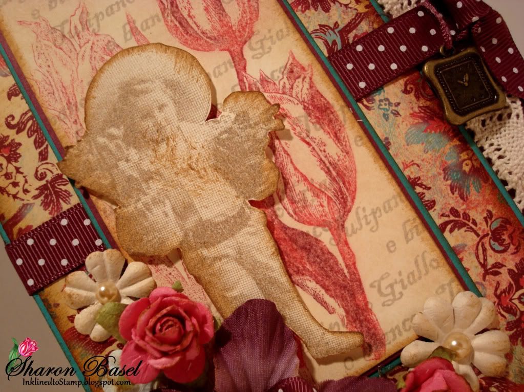
I thought this sketch looked a bit vintage - I visualized the scalloped edge as lace right away.  So, I decided to use a new stamp set I discovered at a local scrapbook store that I visited on vacation.  The set is from Oxford Impressions called "The Fairest Flower".  What is unique in the set are the stamps that look like vintage photographs!  I don't really know how they do it, but it is so cool how they turn out.  This card uses one of the photo images from the set as well as the vintage-looking tulips and the coordinating script.

When using the stamps, I found that Versafine dye inkpads work the best and I was able to find the ink in "Vintage Sepia".  It is a perfect ink for these stamps.  The child on my card was stamped using this ink on Stampin' Up Vanilla cardstock.  I cut out the image and distressed the edges with Tim Holtz "Vintage Photo" distress ink.  I used the same distress ink on the edges of just about everything on this card - even the flowers - to add that antique look and tone down some of the brighter colors.  I also used "Antique Linen" distress ink on the main tulip panel.

The tulips were stamped using Rich Razzleberry and Melon Mambo watercolor markers - stamped twice without reinking the stamp.  I used Sahara Sand for the text stamp and stamped over the tulips. And of course, all the colors were inspired by the wonderful DP from KaiserCraft's "Gypsy Sisters Collection" - when I saw it I knew it would be perfect for this vintage card that I was creating in my head.

Welcome to the Midnight Madness Design Team and others visiting my blog. Thanks so much for stopping by!


Recipe:
Stamps - Oxford Impressions "The Fairest Flower"
Ink - Tim Holtz Distress Inks "Antique Linen" and "Vintage Photo", SU Sahara Sand, Rich Razzleberry, Melon Mambo, Versafine "Vintage Sepia"
Paper - KaiserCraft "Gypsy Sisters Collection", SU Rich Razzleberry, Bermuda Bay, Vanilla
Accessories - Flowers are all Prima, Charm is Plaid "Pearls & Pumps" collection

Thursday, July 15, 2010

Make Your Own - MMSC62

Hello wonderful followers of my blog!  Today's card is for this week's Midnight Madness sketch challenge MMSC62 pictured below.  I had a lot of fun with this sketch.  And I love the Midnight Madness ladies  - they are lavish with their comments on the creations you enter in their weekly challenge - makes you feel so good! 

When I first saw this sketch a whole other idea came to mind. Until this morning when this card popped into my head and I rushed right off to bring the idea to life.

I grew up sewing as a kid - made doll clothes and by middle school was making my own clothes. I still sew but not as much as I would like - rubber stamping sort of steals all my time.  So I fell in love with this Hero Arts image called "Make Your Own" and fashioned after an old sewing pattern. Brought back lots of memories!  The other stamped image of a dress form is from Darcie's Stamps.

For the card I used, of course, Cosmo Cricket's "Material Girl" papers.  The background paper is also CC from "Garden Variety".  Both lines of paper coordinate together beautifully and I've been using them a lot lately.  Such nice warm colors. Plus a little bit of Antique Linen distress ink on everything helps add to the vintage feel of the card.

Instead of pure rectangles, I used an EK Success label punch for the curvy shapes.  For the main image panel background in Wild Wasabi I used my Nesties Label 8 die and sewed around the edge.  After all, a sewing-focused card has to have some sewing on it - right?!!  Oh ... and buttons (lots of  them) too!

Thanks for stopping by!


Recipe:
Stamps - Hero Arts "Make Your Own", Darcie's Stamps JCS112
Paper - Cosmo Cricket "Material Girl" and Garden Variety, PTI Vintage Cream, SU Wild Wasabi, Dusty Durango, Baja Breeze
Ink - Palette Noir Black, Tim Holtz Distress Ink "Antique Linen"
Accessories - EK Success Label punch, Fiskars "Heritage" corner punch, Spellbinders Nestabilities Label 8 Dies, PTI Vintage buttons, Lace

Tuesday, July 13, 2010

Sunflowers of Provence - Play Date Cafe

The first thing that comes to my mind when you mention the Provence region of France is sunflowers - lots of them.  So when I saw at the Play Date Cafe the challenge was Provencal Style using the colors in the image below as the inspiration, I knew I had to start with sunflowers as a main focus. I also knew I'd combine that with a variety of colorful patterns that stand on their own when alone, but then when combined together look related and a perfect match for one another.

The individual patterns I selected here are from different manufacturers and designers and wouldn't be seen together in the store. However, when combined here they work in harmony for that Provencal feel.  These wonderful papers are from Creative Imaginations "Narratives" (blue and cream), October Afternoon "Fly a Kite" (yellow) and Basic Grey "Pattern Paper" (multi-color floral).  A little bit of distressing, using Tim Holtz "tea dye" distress ink, was done to provide an aged feel and some definition.  I also stamped french script lightly on the blue and cream paper to add some depth and for that Provecal tie-in!  Same with the Fleur de Lis punched edge on the SU Regal Rose paper.  If it's French you've got have a fleur de lis somewhere - right?!!!

The sunflowers stamp used here is new from Hero Arts.  I colored it with my Copic markers and sponged the blue ink (SU Bashful Blue) to pick up the blue in the background paper.  In the flower centers I used copper Stickles to add the bit of sparkle and depth needed for the image to pop.

For the finishing touches - a handmade distressed flower made from my SU scallop circle punch, a few Papertrey vintage buttons and some beautiful lace stitched on that I recently got at Joanne's.  The layout of the card is from the Splitcoast Stampers sketch challenge (SC288).

Merci for stopping by today.....  Au revoir et salut!


Wahoo! Another award for my work.  This card received an honorable mention in the Play Date Cafe Challenge PDCC37!  They call the honorable mentions "Cream in our Coffee"!  I call it WONDERFUL!!!!
Thanks to the design team!


Recipe:
Stamps - SU French Script background, Hero Arts "Three Sunflowers"
Paper - October Afternoon "Fly a Kite: Dandelions", Creative Imaginations "Narratives", Basic Grey "Pattern Paper", SU So Saffron, Regal Rose
Ink - Palette Noir Black, Copic markers, Tim Holtz "tea dye" distress ink
Accessories - Nesties Labels 8, circles and scallop circles dies, EK Success fleu de lis edge punch, Papertrey vintage buttons, lace

I'm Flying High Today....!

Well I'm flying high today...  I just found out my card "Tea Time" received recognition as one of the Midnight Madness Remarkables!  Holy moly what an honor - you've just got to see the "remarkable" talent and creativity of the crafters that participate in the Midnight Madness challenges and the works of art that come from the design team there - quite humbling I would say!  My feet are doing a little happy dance right now!  Thanks to everyone on the Midnight Madness design team - Brenda, Carol, Charlotte, Darsie, Denise, Gunn, Holly, Linda, Pam, Phyllis, Priscilla and Tracy!

And now on to my card for today....pretty fitting for the occasion since I'm flying high, right?!!

I made this card for a friend of my son's who loves my handmade cards and keeps them all year long on display in his room - like they are heirlooms or something!  He's such a cutey about that.  And his fondness for my creations prompts me to put just a little more effort in each time to make the next card the best.


For Michael's birthday card this year I used Papertrey's Up Up and Away stamp set.  I think this is a great stamp set for making guy cards.  I colored the balloons with my Copic markers after deciding on the cardstock and designer papers that I would use.  I liked the richness of these colors together - Riding Hood Red, So Saffron, Olive and Brocade Blue (all Stampin Up).  And conceptually I had this layout in my head so the card went together pretty quickly. 

For the clouds, I used the Papertrey cloud dies and their stampers select white cardstock. The large ones I popped up using dimensionals and then also used dimensionals to pop up the balloons on them.  And while Papertrey also makes dies for the balloon shapes, I cut these by hand.

I was pleased with how this turned out but Michael was ecstatic and told me I make the best cards.  I just love that kid!

Thanks for flying along with me today!


Recipe:
Paper - Stampin Up Riding Hood Red, So Saffron, Olive, Brocade Blue; SU designer papers all retired now
Ink - Palette Noir Black, Copic Markers E33,YR23,YR31,R27,R29,R59,B45,B97,G94,G99
Stamps - Papertrey Ink "Up, Up and Away"
Accessories - Papertrey Cloud Dies, Nesties Scallop Circle Dies, SU Scallop edge punch, Papertrey vintage buttons
Sunday, July 11, 2010

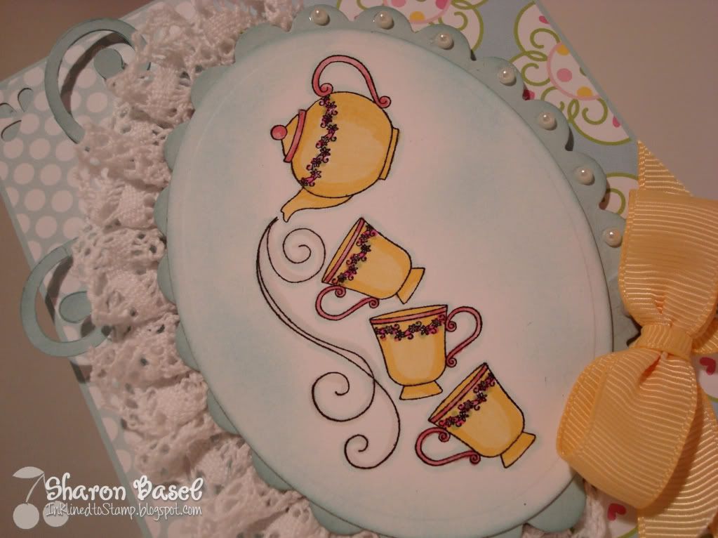
Tea Time - MMSC61

And now for something completely different than my last post!  From bright colors to softer colors, as well as another challenge I'm trying my hand at.  This card was done for the Midnight Madness sketch challenge #61.  I've wanted to participate in these challenges for some time and now with my vacation I have some time to explore all of them and participate! Boy am I having fun!

For this card I used a sweet stamp from Great Impressions.  I picked this up "free" from my raffle win at the spring stamp show here.  I thought this was perfect for this sketch challenge.  I colored it with my Copics and added a touch of glitter with my Sakura glitter gel pen along the flowers at the top edge of the teacups and teapot.

I also thought these papers went well together and with the finished image.  The DP on the left is from Jillibean Soup called "Egg Drop Soup".  The other paper on the right side of the card is "Ice Cream Parlor" from Doodlebug Design Inc.

I added some lace - newly acquired from my trip yesterday to Joann's. I've long admired the cards embellished with lace and never thought about it when I was out getting supplies - until yesterday.  I am fully stocked and I love the look the lace provides so you'll see more lace from me in the future!

And finally, the last few embellishments to finish off the card include the Sizzlet Scribbles Swirls in Soft Sky cardstock, the half pearls along the scallops on the right of the focal image, the bow and the punched corners using my new Fiskars "Lace" three-way corner punch.

Thanks for taking time to visit my blog.  I hope you're inspired by my creations - I certainly am inspired by yours!


Post edited on Monday, July 12, 2010 - I just looked on the Midnight Madness website and saw that my card "Tea Time" has received one of the Midnight Madness Remarkables awards!  Double wahoo and a happy feet dance!  Many thanks to the wonderful ladies on the design team for the recognition.  I am so grateful and actually quite humbled - there are many very talented and creative crafters that participate in the Midnight Madness challenges.  It's gonna be a great day!

Recipe:
Paper - Jillibean Soup "Egg Drop Soup", Doodlebug Design Inc " Ice Cream Parlor", Stampin Up Soft sky, Papertrey Ink Stamper Select White cardstock
Ink - Palette Noir Black, Copic Markers
Stamps - Great Impressions F360
Accessories - Lace, Nestabilities Ovals and Scallop Ovals, Sizzix Sizzlet "Scribbles Swirls", Fiskars "Lace" 3-way corner punch, half pearls, SU ribbons

Laundry Day - Mojo146

Well I'm having fun on my vacation so far - spending lots of time at the club pool with the kids and in my craft room stamping.  I've finally had the time to work on cards for various challenges - there are a ton of them out there!  

This card is one of those for the Mojo Monday sketch challenge #146.  I thought this was a great sketch and gives me a chance to also break out a variety of my favorite papers and some fun stamps too.

I've used the "Loads of Fun" stamp set from There She Goes.  This set is definitely "loads of fun" - lots of images and some cute sayings to go along with them.  I colored them using my Copic markers (see recipe below). 

The papers were a perfect match with the stamps.  They are all Cosmo Cricket papers: The Boyfriend, Garden Variety and Material Girl.  I just love these papers and their colors - I think it makes for a bright, happy card.  Kind of makes you think doing laundry is fun doesn't it?!!!!!


Thanks so much for stopping by today.  Do you think this card is "loads of fun" ?
Recipe:
Papers - Cosmo Cricket: The Boyfriend (laundry background paper), Material Girl, Garden Variety; Stampin Up Tangerine, Olive, Baja Breeze
Ink - Palette Noir Black, Copic markers (R05,R17,YR31,Y17,YR23,BV23,YG95,G99, BG23,C-1,YG91, R27,R37,R59
Stamps - There She Goes "Loads of Fun"
Accessories - Nesties circle dies

Thursday, July 8, 2010

A Daisy of a Day!

Well this is a daisy of a day!  I found out in the wee hours of this day that my Poppies card (see previous post here) was selected as one of the Fab 4 on the Play Date Cafe Challenge!  I'm so thrilled about the recognition of my work - it took me all of two seconds to get the logo posted on my blog (see left column under awards!)  Thanks to the Play Date Cafe design team and especially Julie Ranae who led the challenge for the team.  I'm very grateful!


Now on to today's post......  This is the second card I've done using the new Friendship Jar stamp set from Papertrey Ink.  I love this set - there are many more "accessories" from the Friendship Jar Fillers set to use with the jar so you'll probably see more in the coming weeks. 

For this card, after stamping the images with Palette Noir Black ink, I colored the image using the new Pebbles Metallic Cream Chalks. That was my first time using this medium and I loved how silky smooth they go on and I like the metallic finish. Hopefully you can see the sparkle that they give in these photos.  I used the applicator provided as well as a blending stump I had for the tighter areas. These chalks provided a subtle color that I really wanted for this image. 

To finish off the card, I layered the image panel on Not Quite Navy cardstock and then on So Saffron - both from Stampin Up.  The base white cardstock is from Papertrey Ink.  The punches for the edge designs were Stampin up and Martha Stewart. 

Thanks so much to all of you that take the time to visit my blog and comment on my work. I truly appreciate that - it makes for a daisy of a day and puts a smile on my face!

Monday, July 5, 2010

Poppies, Poppies, Poppies!

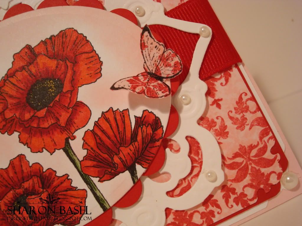
 This "Poppies" card was made for the Play Date Cafe Challenge #36 using There She Goes stamp set.

If you can't tell with your visit here to my blog, I love the combination of red and pink! So when I saw the Play Date Cafe challenge this week to use red, pink and white it was right up my alley and I knew instantly I had to play! 

I started with these gorgeous poppies from the There She Goes "Poppies" stamp set.  I adore poppies because of their beautiful color and this stamp set, designed by Chris Dark, is fabulous.  I loved coloring these flowers with my Copics!  I used R27, R37 and R59.  The main image panel background was sponged with Stampin' Up Pink Pirouette ink and then cut out using Spellbinders oval dies.  The SB scallop oval dies were also used with Papertrey Ink Pure Poppy cardstock. 


I created my own designer paper for the background panel using Papertrey Ink's "Damask Designs".  It started with Pink Pirouette cardstock and ink, stamping the design repeatedly.  Then I went over it - slightly offset with PTI Pure Poppy ink (I know...poppies everywhere!). I just thought the pink in the background would give it some depth. The corners were punched with Fiskars "Heritage" corner punch and then the panel layered on the Pure Poppy cardstock and then on SU Whisper White.  All that was mounted on Pink Pirouette cardstock.

For the white filigree layer, I used Spellbinders Shapeabilities Pendants dies called "In Spades".  I layered two of them to achieve this effect.  Some red grosgrain ribbon that I had was threaded through and under the image panel.

A final touch was stamping the butterfly image from the same "Poppies" stamp set onto the scrap of the background paper I created.  I stamped two, cut them out and adherred them with small pop dots on to the main focal image.  The last embellishment was adherring the half pearls around the white filigree panel and in the corners of the card.

I like how this turned out - I mean, really, who doesn't love red and pink together?!!  Tell me what you think...

Thanks for stopping by!


Update to this post on July 8, 12:26 a.m.:   My "Poppies" card made the FAB 4 at the Play Date Cafe!  Thanks to the Design Team for the recognition!  Wahoo!

"The beginning of the summer holiday..."


This is the perfect card right now as I have officially begun my two week vacation!  Or as the DP says.... "This was the beginning of the summer holiday...."  I did this card for the Splitcoast sketch challenge #287.

  First, I fell in love with this Lockhart stamp.  It just spoke summer to me - don't you think Adirondack chairs are totally a symbol of summer?  This is one of the stamps I picked up when I won that raffle at the stamp show in the spring! 

I colored the image in off-white, pale blue and greens using Copic markers and it coordinated wonderfully with these papers.  The word paper is by October Afternoon called "Sprinklers" and the other two are Basic Grey from the "Kioshi" collection.  I loved this word paper - and I thought it was a perfect pairing with the stamp image here. 

To add a little more dimension and texture to the focal image, I used Flower Soft as part of the grass and as a few of the posies in the flower pot to make those areas pop a bit more.  All in all I'm pleased with this card overall - wish you could see it in person as the colors are a little more intense but still are soft.

Thanks for taking the time to visit my blog today! 
 

Sunday, July 4, 2010

God Bless America!


Happy Fourth of July bloggers!  This is a very quick post of a card I  whipped up for the holiday using Stampin' Up's "July Fourth" stamp set and the coordinating "stamping around" wheel.  I usually remove the rubber stamp from the wheel (a trick my friend Emma taught me) because its so much easier to use as a regular stamp (I just never can get the right ink coverage or details where I want them otherwise).

On this card I also used the Cuttlebug stars embossing folder. 

Here's hoping that everyone has a safe and relaxing holiday with friends and family.  Enjoy your day and thanks for taking time to peek in at my blog!

Happy stamping!
 

Saturday, July 3, 2010

Tulip Trellis


Just a quick post today on a card I quickly put together using a Lockhart stamp I was playing with. I colored the image using my Copic markers - a bit more challenging than using Prismacolor pencils on this image!


I chose the colors for this card on what, in my eye, made the focal image and colors pop more.  Not sure I'm satisfied with it - that is all but the image itself (I do like how that turned out!).  Let me know what you think.

Thanks for stopping by!