Showing posts with label Papertrey Ink. Show all posts

Saturday, July 30, 2011

Sensational Saturday at Sugar Creek Hollow

Happy Saturday! Today is the start to another sensational challenge at Sugar Creek Hollow.  This week we're challenging you to create your own designer paper using stamps or other unique treatments.  No purchased scrapbook or designer papers - just what you can create on your own.  And of course, create a card in a vintage or shabby chic style.

My card was created with background paper that I created by stamping on kraft-color cardstock using Papertrey Ink's "Damask Designs" stamps.  I also created the paper with the swirls using PTI's "Fancy Flourishes" stamps.

The main image panel features a Hero Arts image called "Bird Collage" also stamped in black ink on kraft cardstock that was tattered and then distressed with tea dye and old paper distress inks.  A few pearls, a fabulous stripe ribbon and it's complete. 

Won't you join us this week in the "create your own designer paper" challenge?  You'll have fun giving it a try.  Stop on by the Sugar Creek Hollow blog and see the design team creations for a little inspiration - you'll be glad you did!

Thanks for stopping by!

Monday, March 14, 2011

StampFairy Challenge - Show Us The Green!

Happy Monday! We're starting another challenge at StampFairy and this week we're challenging you to go GREEN! Yep, create a card or project that uses green (a lot) and you'll fit right into this challenge! Of course lots of us are doing that in celebration of St. Paddy's Day on Thursday. I created my card though to wish a friend best of luck that is leaving our company and moving to North Carolina.

I've used "Herb St. Patrick's Day" that you can find at the StampFairy Shop. The clover image is a freebie and I've printed it twice in two sizes for this card. As you can see, Herb is sitting in a pot of gold - undoubtedly at the end of rainbow somewhere! I paired this adorable image with papers from Cosmo Cricket "Social Club" and "Salt Air" and Papertrey Ink "Green Boutique". The layout design of this card is based on a sketch from The Sweet Stop-SSS99. The sketch design is at the bottom of this post.
I sure hope you join us in the challenge this week. We love seeing your creativity and visiting your blogs to comment. I've seen so many talented crafters' work by visiting all the entries - I love that. If you enter you just might win big! The first place winner receives 3 StampFairy digi images, second place gets 2 images and third place get 1 free digi from StampFairy. So there's lots of chances to win!

Just be sure to use a StampFairy image to qualify for the winning prizes though. There are plenty of freebies in the StampFairy Shop.

And also in the shop now are these fabulous collections that were just released last week:

Introducing the adorable Panda Paul Bamboo.....


And here's the newest collection featuring the popular Clementine....


You can see these new digi stamps at this StampFairy Shop link.

Now head over to the StampFairy Challenge Blog to see all the other GREEN cards created by the design team to inspire you this week!

Thanks for stopping by!
I'm entering this card in The Sweet Stop challenge SSS99 using their fabulous sketch for this card.

Wednesday, January 5, 2011

Sweet Sketch Wednesday - SSW83

Happy Wednesday everyone - it's time for another Sweet Sketch Wednesday challenge! Lori Boyd of By Lori Designs is our sponsor this week and my card features "Bumble Bee" from the Lollipops collection at the By Lori Designs blog here.


The Grand Prize winner of the challenge will receive a $10 gift certificate from By Lori Designs! What a fantastic prize - you won't want to miss your chance at that. And all you have to do is create a card using the fabulous sketch below, post your card to the Sweet Sketch Wednesday blog and leave a comment there.


This great sketch, by our talented Arlana Patten, will be one that you'll turn to time and time again. It's such a versatile design and what a blast to create with this sketch and the wonderful digis from By Lori Designs.

The image was colored using Copic markers and then some glitter added on the wings and this little guy's belly. The flowers were created using a SU scallop circle punch with Daffodil cardstock and pages from my local phonebook. You just punch out the circles and crumple them until you get the look you like. A gem brad holds them in place together and adhers them to the card panel. The yellow DP is by October Afternoon "Fly a Kite" and the other panels are hand stamped with Papertrey Ink stamps.

Now scamper off to the Sweet Sketch Wednesday blog to see the rest of the design team creations for your inspiration. Other By Lori Design digis are featured there as well. Thanks for stopping by!

Thursday, November 25, 2010

Grateful

Happy Thanksgiving to everyone in the U.S.! I'm looking forward to a day of family gatherings, great food and thoughts of the so many things I'm grateful and thankful for. One thing is certain, I am truly thankful for my fellow bloggers around the world that share their incredible talent and ideas online. And I'm grateful for all those that follow me in particular and appreciate their support and comments along the way. Have a wonderful day and thanks for stopping by!

Tuesday, November 23, 2010

Merry & Bright at the Play Date Cafe

Gosh I love vacation days! I've been able to just do what I please - like playing in my craft room, catching up on projects and getting to join a few fun challenges like the Play Date Cafe.  It's been a few weeks since I've played in the Cafe and it feels good to be back at it again.

Here's the inspiration for this week's challenge PDCC56 - use Red, Olive and Turquoise colors in a card or project.  I thought these colors were a lot of fun together - "Merry & Bright" if you will!


This card went together rather quickly once the idea came to mind.  It helped to have Papertrey Ink DP on hand that comprised two of the colors in a variety of patterns.  I love mixing patterns and I'm pleased with how this turned out. 

The actual colors I've used are Stampin Up Old Olive, Tempting Turquoise and Real Red.  I've had the darndest time in photographing the red properly, including fussing with photo color editing.  You'll just have to imagine the pure red here and not the orangie color that appears (at least on my computer). 

Thanks for stopping by!

Sunday, October 10, 2010

Up For a Challenge! MMSC74 & PDCC50

Alas, it's Sunday night and I'm dreading the work thing tomorrow! So in usual fashion, I've buried myself in my craft room trying to escape from thoughts of the work week and created this card for two challenges. 

I seldom do one card for two challenges but it just worked out that way with this one.  The colors are for the Play Date Cafe Challenge PDCC50 - White, Green and Melon.  The wonderful sketch that I followed is compliments of Priscilla at Midnight Madness MMSC74.

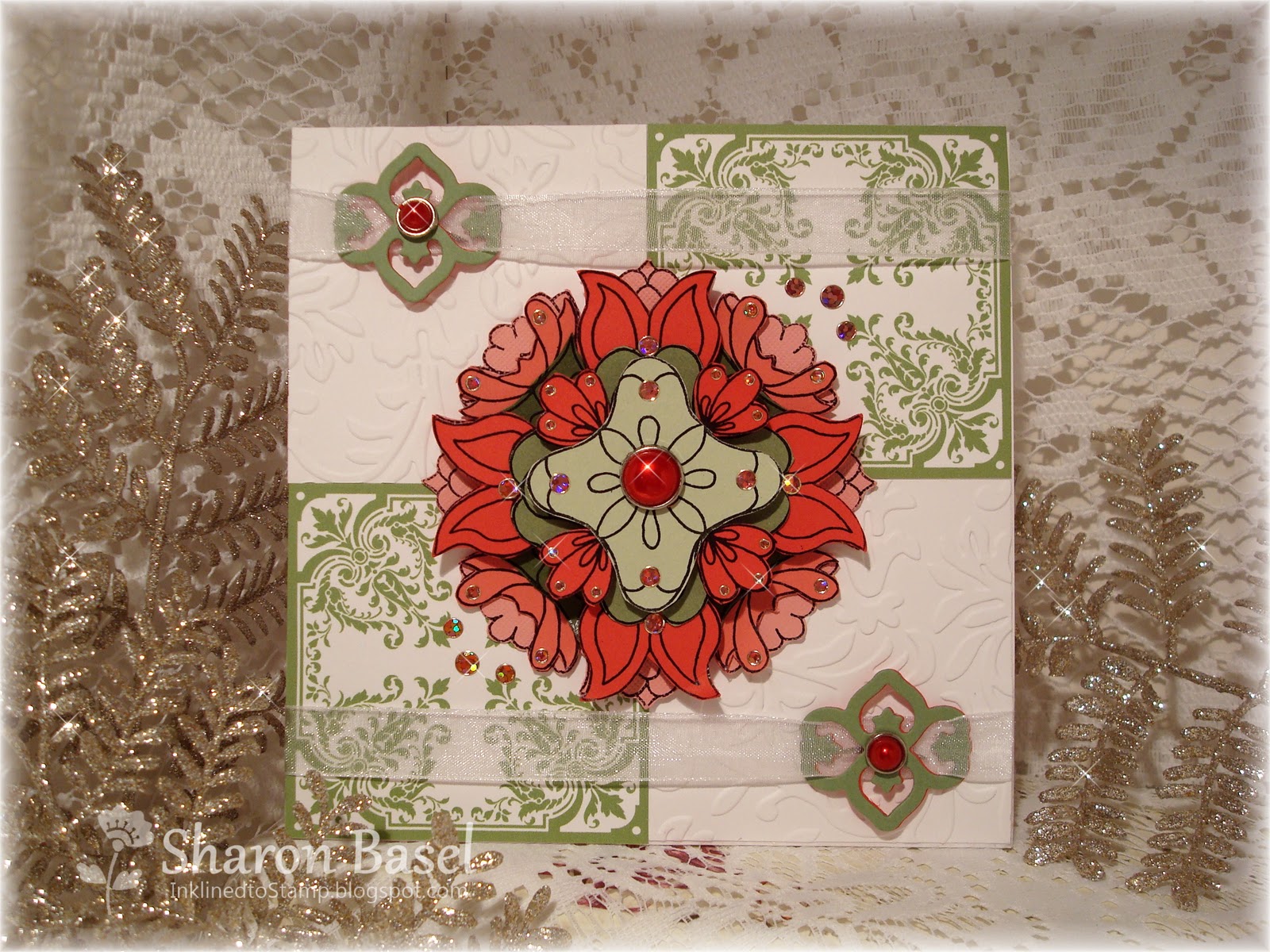
When I saw the MMSC74 sketch, I thought of this stamp creation. Can you believe this is created from one single stamp?!  Well it is!  It's a stamp from Holly Berry House that I saw demonstrated at a craft show this summer.  I had intended to do just this with it - a single statement/focal point for Christmas cards.  Thanks to Julie Ranae at the Play Date Cafe, I'm getting an early start on my cards!  The green and white ornate panels are a digital stamp from Sugar Creek Hollow - a new one from the Christmas image release.

This picture shows the layers achieved with this single stamp.  To create this effect, you stamp the image on different colors of cardstock and cut out each layer following a variety of cutting lines.  Truly the sky is the limit on how many unique medallions you can create with the one stamp.  Here I chose three varying shades of green and three varying intensities of melon.  In all, there are eight layers to created this medallion.  Not difficult, just a lot of cutting. In the end, it looks very dramatic and has a grand presence on a card. 

Tell me what you think by leaving a comment below.  Thanks for stopping by!
P.S.  Those who visit my blog regularly will notice I've changed my look for Fall.  I haven't given up on my cherries theme - just retiring it until next spring.  All the papers and embellishments used to create this blog look were purchasing through Shabby Miss Jen designs.  A link to the SMJ website is on my left sidebar.


Recipe:
Stamps - Sugar Creek Hollow "Christmas Plaque"; Holly Berry House "1343L"
Paper - Papertrey Ink White, Melon Berry, Avocado; SU Poppy, Regal Rose, Olive, Celery
Accessories - Glitter stickers, red pearl brads from Recollections; Spellbinders "In Spades" die (ribbon embellishments), Cuttlebug embossing folder


Saturday, October 9, 2010

Sensational Saturday at Sugar Creek Hollow

It's another sensational Saturday with Sugar Creek Hollow and today we're working with a sketch challenge that was perfect for these two Sugar Creek Hollow images called Fall Church and Fall Bingo.  Autumn is my favorite season and I can't get enough of the fall images at SCH. 

Here's the great sketch that our DT coordinator Joseline designed for this weeks challenge.


I colored this wonderful SCH Fall Church image using Prismacolor pencils and then went over it with Gamsol to blend and set the colors.  It also really makes the colors pop brighter and richer.  A little bit of sparkle was added with a Sakura glitter pen.  A Spellbinders Labels 10 die was used to cut out the focal image which fits these dies perfectly.  That fabulous ribbon is also a Sugar Creek Hollow exclusive - hand dyed "Country Crinkled Ribbon" made by Tracy Vinson.

So glad you stopped by on this beautiful Fall day!

Recipe:
Stamps - Sugar Creek Hollow digis "Fall Church" and "Fall Bingo"
Paper - Scribble Scrabble "Sweet Shoppe" collection, Papertrey Chocolate and Melon Berry
Accessories - Sugar Creek Hollow "Country Crinkle Ribbon", Spellbinder Labels 10 Nestabilities dies, K&Co tapestry brad

Monday, September 27, 2010

Morning Glory - PDCC48

It's Sunday night and I'm trying to squeak out every last bit of the weekend. Instead of going to bed early, I chose to create this card for the Play Date Cafe color challenge 48!  I'm such a night owl anyway, but get me going on my stamping and card creating and it's hard to stop - even if tomorrow begins the work week again!


Here's the challenge inspiration photo that Julie Ranae chose and that the colors were picked from.  I have to say that would be a fun kitchen to cook in - but I'm partial to brighter, intense color anyway.  So I was inspired right away to use Concord Grape, Pear Pizzazz and Going Gray as my color pallette for the challenge card.


I also couldn't wait to ink up this Morning Glory stamp from Papertrey Ink - it just arrived in the mail yesterday.  When I think of a Morning Glory flower, I think of a purpley-blue color and thought it would be perfect. 

The card design/layout is mine - just wanted something unique for this card.  So tell me what you think...

Thanks for stopping by!
Recipe:
Stamps - Papertrey Ink "Morning Glory"
Paper - SU Concord Grape, Pear Pizazz, Going Grey, Watercolor paper
Ink - Stazon Black; SU Concord Grape, Pear Pizazz; PTI Vanilla
Accessories - MS corner and edge lace punch; Sakura gelly roll glitter pen

Friday, September 24, 2010

Rah! Rah! Sis Boom Bah! Sweet Sketch 68

I am loving these sketches from Sweet Sketch Wednesday! This week's sketch (Sweet Sketch 68) was perfect for my card designed especially for my niece Jenny who is celebrating her 12th birthday today.  She's a cheerleader for her middle school and this image from Mo Manning at Digital Pencil Too is just perfect also!

This card went together pretty quickly - partly due to having the great sketch to follow and because the colors were already established:  Jenny's school colors of navy and gold.  The golden yellow papers are from three different companies but coordinate well together.
I printed the digital image on shimmer white paper. The only difficulty in coloring with Copics was to get the cheerleader's uniform navy without it being too dark.  I think this turned out okay. It sure looks like my niece!

I went with what I call the text message birthday greeting - I know Jenny will love that.  Hope she thinks her Aunt is cool for using it!  Took me a while to figure out what it was in the Papertrey "Birthday Bash Sentiments" stamp set.  Yes, I am lame when it comes to text message lingo!  The little bow in the corner is supposed to resemble a pom-pom for cheerleading.

So let's cheer for Jenny today!  Happy Birthday sweet niece - you're loved bunches!

Thanks for stopping by today!

Post edited 9/29/10:  I won the Sweet Sketch WednesdayChallenge #68 for this card!  I'm so excited about this!  Thanks to Arlana for the great sketch and all the members of the Sweet Sketch Wednesday design team!

Recipe:
Stamps - Mo Manning for Digital Pencil Too "Gimme A...", Papertrey Ink "Birthday Bash Sentiments"
Paper - October Afternoon "Fly A Kite: Dandelions", Cosmo Cricket "Pinwheels", Bo Bunny "Buttercup Dot", Papertrey Ink Enchanted Evening (blue), White, Shimmer White
Ink - Papertrey Ink Enchanted Evening, Copic markers
Accessories - Spellbinders Circle and Scallop Circle Nestibilities dies, MS scallop lace edge punch, Fiskars "Lace" corner punch, Papertrey Ribbon


Tuesday, August 31, 2010

PDCC44 and HB2ME

What is that title?  It is secret code?  No - it's short hand for it's time for another Play Date Cafe Challenge and Happy Birthday to Me!  Yes today is both!!!

Sara Anderson at the PDCC calls this the "colour horribilis" challenge because the colors picked this week are not ones folks would think work together (Navy, Mustard, Hot Pink).

Oh my, I beg to differ!  At first when I saw the colors I might have had a moment of thinking "well we'll see".  But that was short lived because when I pulled out the color cardstock and put them together, my mind raced with ideas of what could be done with this rich color pallette.  I absolutely love these colors together and so thankful for Sara's challenge to bring them to my attention!


I decided to create a summer sunset background using the Mustard and Hot Pink and that's where this card started.  I picked the new set from SU called "Just Believe" as the foliage in the forefront in Navy.  A little bit of light stamping with PaperTrey's Text Style II stamp to add texture and interest to the background and I was set.  The hot pink and navy designer papers are all stamping up - I created the mustard panel using another stamp from the SU "Just Believe" set.  A few buttons and the Daydream Ticket from Invoke Arts and we're set. 

I love this color combination and think its perfect for the end of summer.  Also perfect as a birthday card to myself today : ) - yes my 51st and I've had a grand day. 

Thanks for stopping by!

Monday, August 30, 2010

August Sunflowers for MMSC68

Oh I had so much fun with the sketch this week at Midnight Madness.  The MM team is so creative - in both sketches and the cards they showcase.  This week tops them all I think - thought I might say that each and every week - LOL!!

For the card this week I chose Priscilla's own Sunflowers digital stamp.  I love sunflowers - particularly at the end of summer when the sun and sky late in the day are warm golden yellows.  They just sort of fit this time of year perfectly don't you think? 

I used the single sunflower offered in the set (which is to die for I might add) and resized it three times.  I layered each size as a grouping in my photoshop software to get this image on my card.  The flowers were colored with Copic markers and then lots of glitter was applied in a couple different shades of yellow.  For the sunflower centers, I added Stickles in Cinnamon and Copper colors.  You can see all the sparkles this card has better in the detail photo below.


To frame the sunflowers image, I used Nestibilities Labels 5 die by placing it and tracing the inside line of the die around the image carefully making sure that each one of the flower overlaps the outer edges of the die. It was cut out by hand and layered on one cut with the die in SU Handsome Hunter cardstock.  The background was colored using Pebbles metallic cream chalks and then distressed on the edges with Tim Holtz Tea Dye distress ink.

The background papers were stamped using Papertrey Ink's Damask background stamp on Wild Wasabi paper with Hunter green ink.  The script is also PTI's Background Basics-Text Style and was stamped in Hunter on Kraft cardstock which was also distressed with Tea Dye ink.  The "Lattice" border trim piece was a die from Spellbinders Borderabilities.  I laced shimmery copper twine around it for some extra sparkle.  Matching copper twine was used for the embellishment in the top right corner of the image.  Don't you just love the richness of the Hunter green with the warm golden yellow of the flowers in this card?  It speaks late summer to me and is the perfect August card. 

Thanks so much for stopping by...come back again soon!


Recipe:
Stamps - PriscillaStyles Digital Stamps "Sunflowers"; Papertrey Ink "Damask Design" and Background Basics Text Style
Paper - Stampin Up Handsome Hunter (retired), Wild Wasabi, Whisper White; PTI Kraft
Ink - SU Handsome Hunter (retired)
Accessories - SU Copper twine; Spellbinders Nestabilities Label 5 dies and Borderabilities Lattice die; SU Scallop lace edge punch